Assembling a Composite Drawing
Module Summary
The last two tutorials showed how to create drawings directly from Rhino, but creating presentation-quality images usually involves more than one piece of software. Different applications have different strengths, and developing workflows which move between them gives you more flexibility and control over the final appearance of your drawings.
In this one we'll be extracting pieces of a drawing from Rhino, and then compositing them together using Photoshop and Illustrator. (Compositing refers to combining elements into a cohesive image, and is sometimes contrasted with collage, which juxtaposes and associates elements without placing them in a unified representational space). We'll illustrate compositing by making a Section Perspective.
This tutorial assumes some basic familiarity with Photoshop and Illustrator, so if you've never used them before or need a refresher, you might check out beginner tutorials from YouTube, Lynda, or Adobe before continuing.
Tutorial
In this tutorial we'll making a section perspective. Like the name suggests, this is a drawing that combines a perspectival projection with a section cut. Here are a few examples:


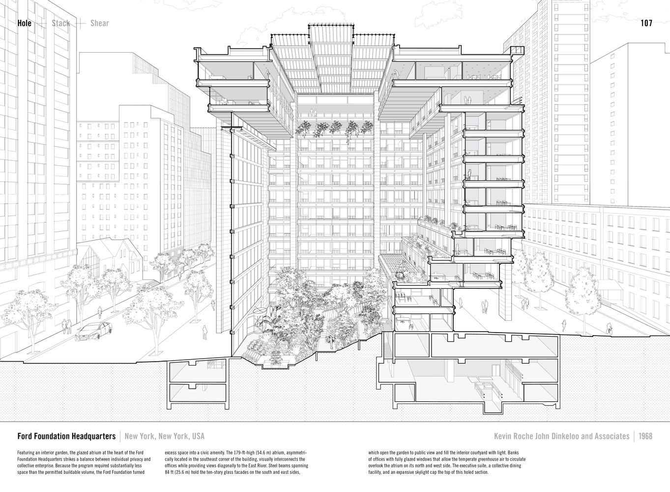
For my section I've chosen a cut and view similar to the one we used in the orthographic drawing tutorial:
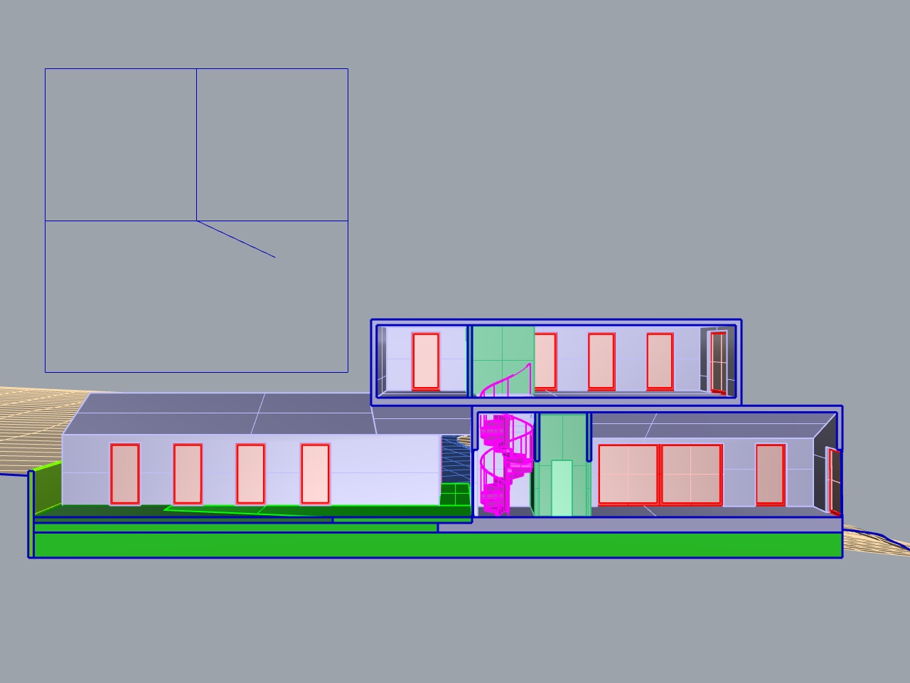
The camera is pointing straight at the plane of the cut, resulting in a One Point Perspective. This means the cut itself won't be distorted, embedding a to-scale architectural section within our more immersive perspective drawing.
Custom View Settings
So far we've been using Rhino's built-in display modes. But to create images of our model, we want more control over what it looks like. Fortunately Rhino's view settings have tons of options for customization.

Let's start by creating a custom display mode that looks like this.
To create a custom display mode, click the dropdown arrow in the upper left corner of your sceen, next to the viewport name, and choose "Display Options." You'll be taken to the customization options for whichever display mode you are currently using. Instead, click "Display Modes" at the top of the list, under "View," to see available display modes listed in the main part of the window. Select the the mode that most closely resembles the one you want to create (Arctic, in our case), and click the "Copy" button.
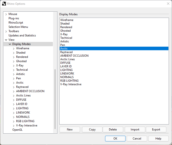
It will be easier to see what we're doing if changes we make are reflected in the viewport, but right now our old display mode is still active. Click "OK" to exit settings, then make the new display mode ("Copy of Arctic") active. Go back to Display Options.

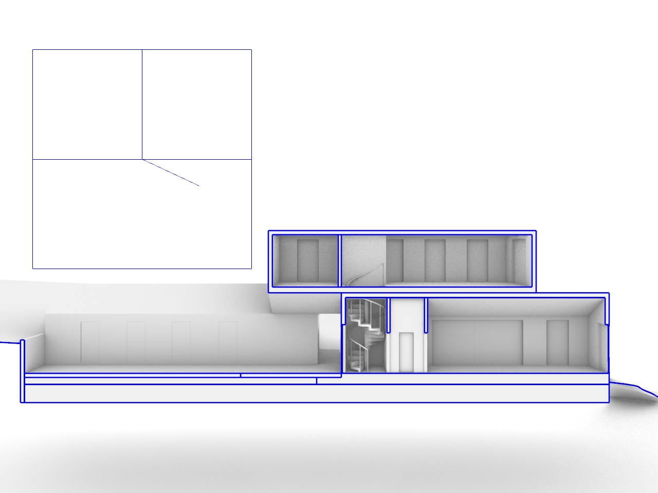
Now we can start changing the appearance of this display mode. Maybe we want the background to display as black instead of white, for more contrast with the building. In the top-level menu, under "Viewport Settings," we can click the swatch next to "Solid color" and change it to black (we could also use the dropdown menu to change it to an image file, or a gradient).
If we scroll down to "Visibility," we can select what categories of object are shown or hidden. Uncheck "Show clipping planes," for instance, and your clipping plane object will disappear, saving you the trouble of hiding it manually whenever you want to capture a view. Maybe you have stray curves in the scene from your modeling process, in which case you can also uncheck "Show Curves."
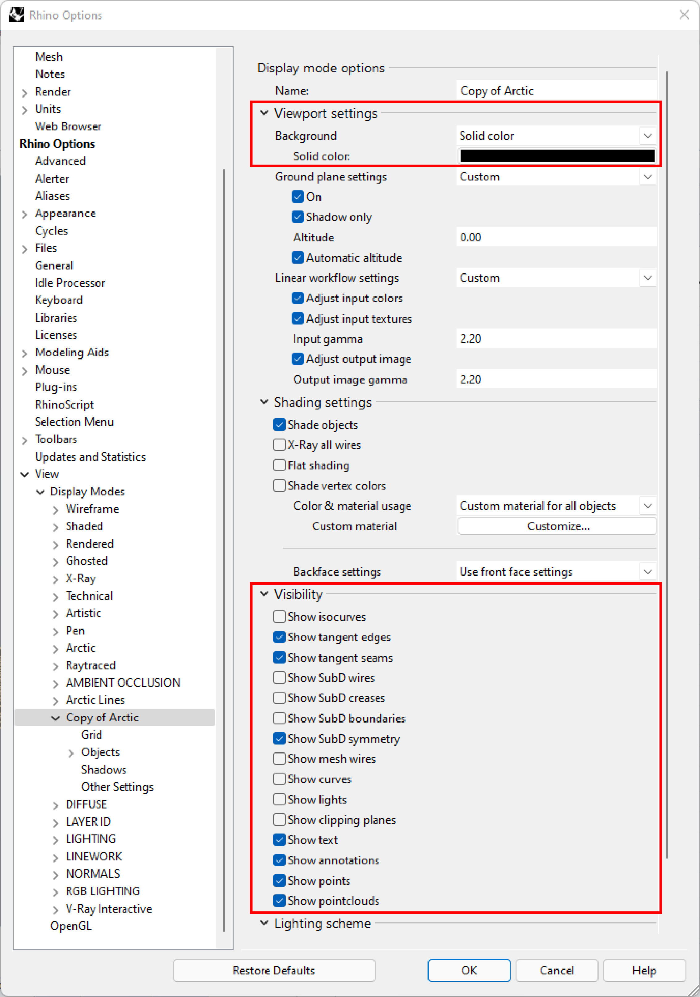

In the left sidebar, expand "Objects" to see the categories of geometry whose appearance you can manipulate. Our model would be more legible if we could see the edges of our geometry, so select "Surfaces" and change the "Edge thickness (pixels)" value to 1. Now we can see our edges, but they have the colors of the layers they're on: change "Edge color usage to "Use single color for all edges" and then "Edge color" to black (which should be the default option) for a more consistent look.
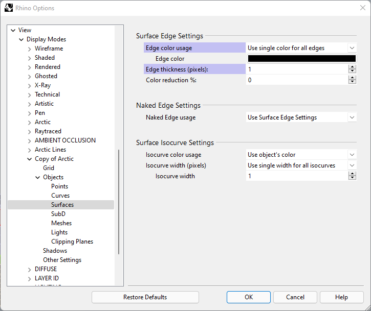
Next we can go down to the "Clipping Planes" section (still under "Objects") to change how our geometry looks where it's been cut. For this drawing I want to emphasize the relationship between spaces rather than the tectonics of the building, so I'll make the cut black as well, so it recedes into the background visually. Change "Color usage" to "Solid color." Unfortunately Rhino has a quirk where pure black surfaces will display as white, so set the Red, Green, and Blue values to 1 to get as close to true black as possible. Finally I'll set the "edge color" to white, so the boundaries of the cut geometry are visible, but reduce their thickness to 1.
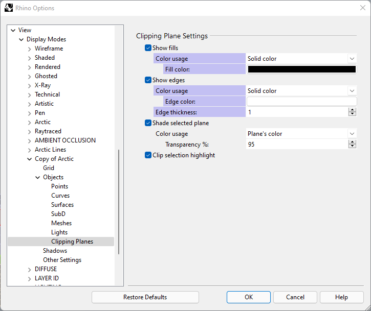
The resulting view should look like this. I've added solid geometry to the ground beneath the building, so we don't see the underside of the terrain. This does create some additional artifacts at the bottom of the image, which I could get rid of by tinkering with the view settings more, but it would be easier to just get rid of them in Photoshop.

That's just one example of the how you can customize your view settings to create a specific drawing, but there's a vast range of possibilities. Experiment with customizing this and other view modes to create your own.
To save this view as an image, use the command ViewCaptureToFile. This lets you specify the desired resolution of the output image.

View Settings for Compositing
Having some custom view settings that you like is great for producing sketches very quickly. But we can also create view settings that capture specific elements or information from the scene, and combine those in Photoshop to create intentional, well-developed drawings in Photoshop that we could never get directly from the viewport.
Some useful ones are described below. You can download and import the .ini files for each one to use them in Rhino, but trying to recreate them yourself will help you understand how view settings can be customized for your own purposes.



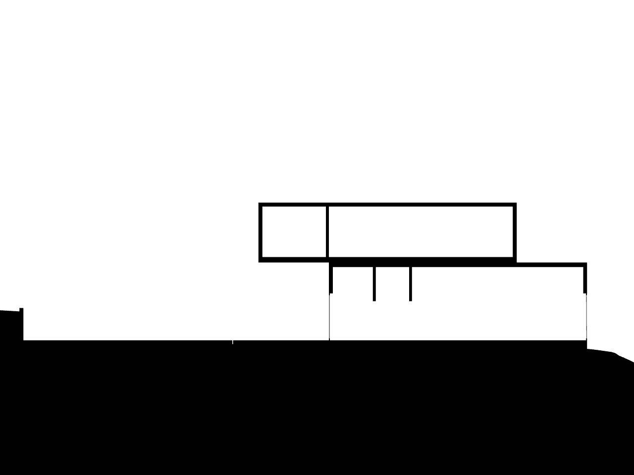
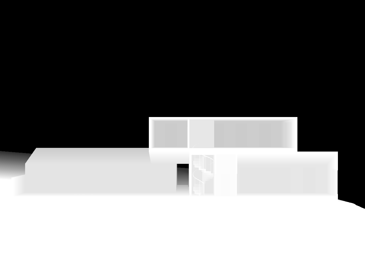
ShowZBuffer command (use the same command again to deactivate it). Shades surfaces from white to black according to their distance from the camera. Useful for fog effects and depth-of-field blurring.
Compositing in Photoshop
To composite these layers of information into a single image, activate them each in turn, saving them out as you go with ViewCaptureToFile. Be sure to use the same view and output resolution each time.
Open Photoshop, and load all of these layers into a new file using File >> Scripts >> Load Files into Stack.
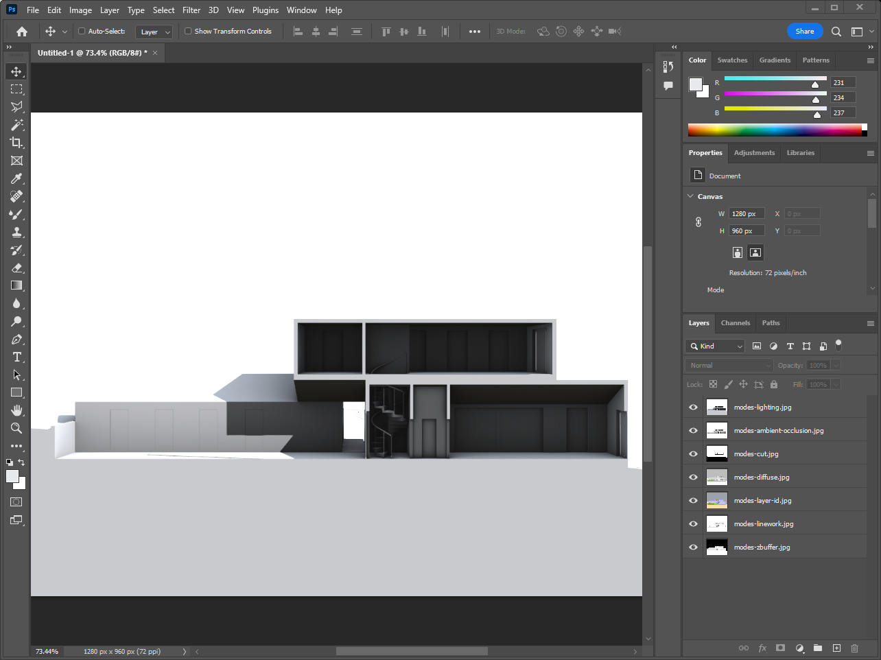
I'm going to use the Diffuse layer (the one with unlit texture maps) as a starting point, so I'll move that one to the top of the stack. Next I want to add some shading to it, starting with Ambient Occlusion, so I'll put that layer on top of it. To combine this shading with the layer underneath, change the blend mode of the Ambient Occlusion layer to "multiply" using the dropdown menu near the top of the layers panel (it's to the left of "Opacity: 100%" and is set to "Normal" by default).

I'm also going to use the "lighting" layer to get just a bit of shadow. Like before, move that one to the top of the stack and set the blend mode to "multiply." That makes the image too dark, so slide the opacity of the layer down to around 20%. At this point I've also shifted all of my layers up the canvas to center the building in the frame (select all of the layers in the Layers panel using SHIFT, hit V to switch to the Move tool, and then use the arrow keys to move the layers).
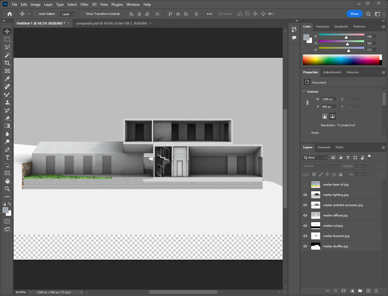
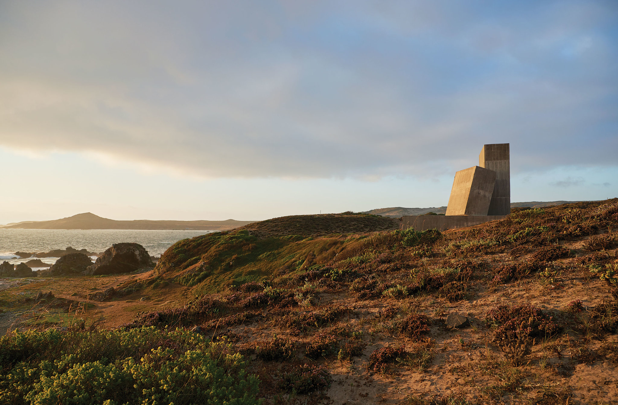
Next let's add some sky and landscape to the background. I'm going to use this image I found in a New York Times article about Chilean architecture (the house we're drawing is actually in the article, but not this photograph). You can copy and paste this directly into Photoshop.
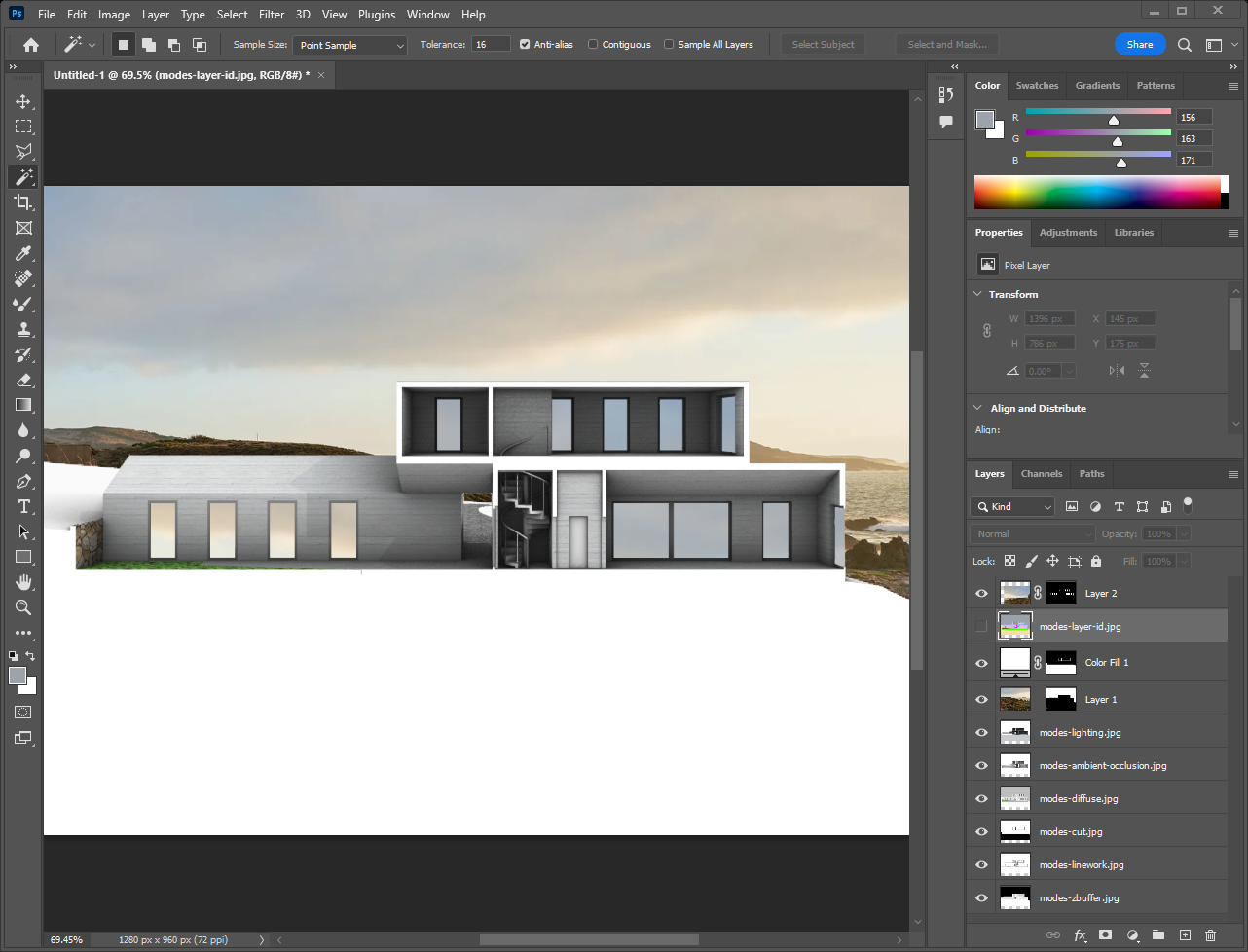
We need to create a mask for this image so it doesn't cover the building. Move the Layer ID layer to the top of the stack and use either the Magic Wand tool ( W ) or Select >> Color Range to select the background area of the image. Then hide the "Layer ID" layer, select the layer with the photograph, and click the Mask icon in the bottom right corner (it looks like a rectangle with a circle in it). Everything outside the selected area is now hidden.
To control the placement of the background image, click the "link" icon between the thumbnails of the mask and photo in the layers panel so you can move them independently. Move the photo around using the Transform and Move tools.

Reflections in the windows can be added in the same way, using the Magic Wand on the Layer ID layer to select them, making a copy of the background image, masking it, and moving it until it looks right.
The same thing goes for the section cut, but using the Cut layer and a solid color (you can add a solid color layer by clicking the icon in the bottom right that looks like a half-black/half-white circle).
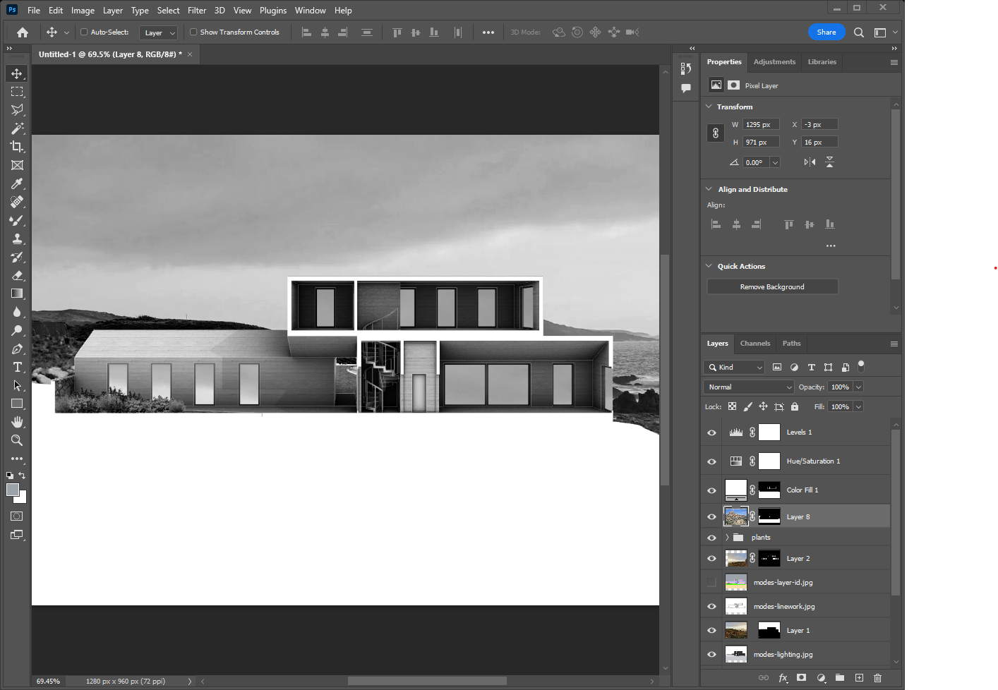
We can incorporate linework by moving that layer on top of the building and changing the blend mode: use "Multiply" and the lines will be black, "Divide" and they'll be white. I've gone with white, and reduced the opacity of the layer to 30%. I've also added a Hue/Saturation adjustment layer (black-and-white cookie icon again) on top of the whole image to make it grayscale. This unifies things a bit while playing up the brutalist, Paul-Rudolphy vibes suggested by the building's cast-in-place concrete construction.

For finishing touches I'll reuse plant PNGs from the Rendering tutorial for the garden, as well as the terrain image from that same tutorial for the hill the building sits on. Lastly I'll add a "levels" adjustment layer on top of everything to tweak the black/white balance.
Before moving on to the next section, try some more experiments of your own.
- Use different background, colors, plants, etc. to create a different mood.
- Add some people to the image.
- I didn't end up using the Z-Depth layer. Can you use it as a mask to create fog, or use the Lens Blur filter (
Filter >> Blur >> Lens Blur) to add a depth-of-field focal effect?
Exporting Vectors to Illustrator
Photoshop is used for raster image editing. For working with vectors, we want to use Illustrator instead.

To create the vector linework, select the geometry in your scene and use Make2D. I'm using the same section view as before, in a NewFloatingViewport with the aspect ratio I want for my final image (in this case, 4:3). For now I'm using these options: no hidden lines, include the viewport rectangle, and don't maintain the layers of source object (to minimize the number of layers we have to deal with later). This produces the following result:
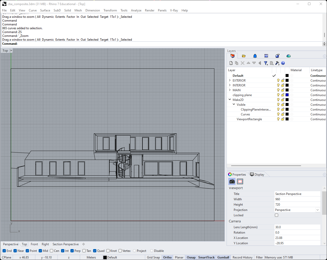
There are some stray lines here which I'll just clean up manually (rather than tinker with unit tolerances or other possible causes) before moving on. When everything's tidy, select all the curves and use the Export command. Save the geometry as an Illustator file using the default settings, then open it up.
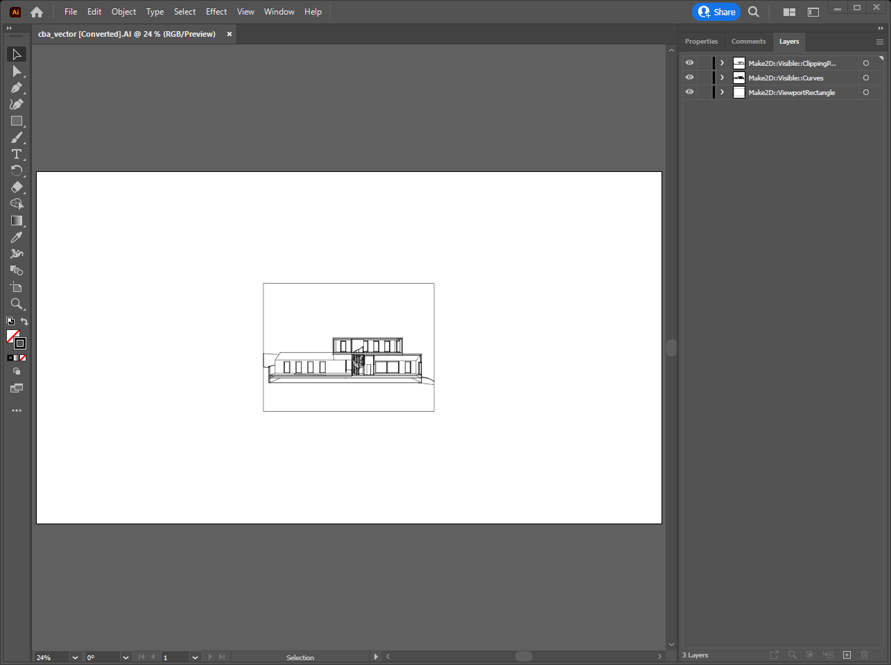
You now have your geometry in an Illustrator file, layers included. Resize it to your desired resolution and change your artboard (Shift + O) to match. A typical next step would be adjusting your overall line weights and giving your curves sharp corners and endpoints.
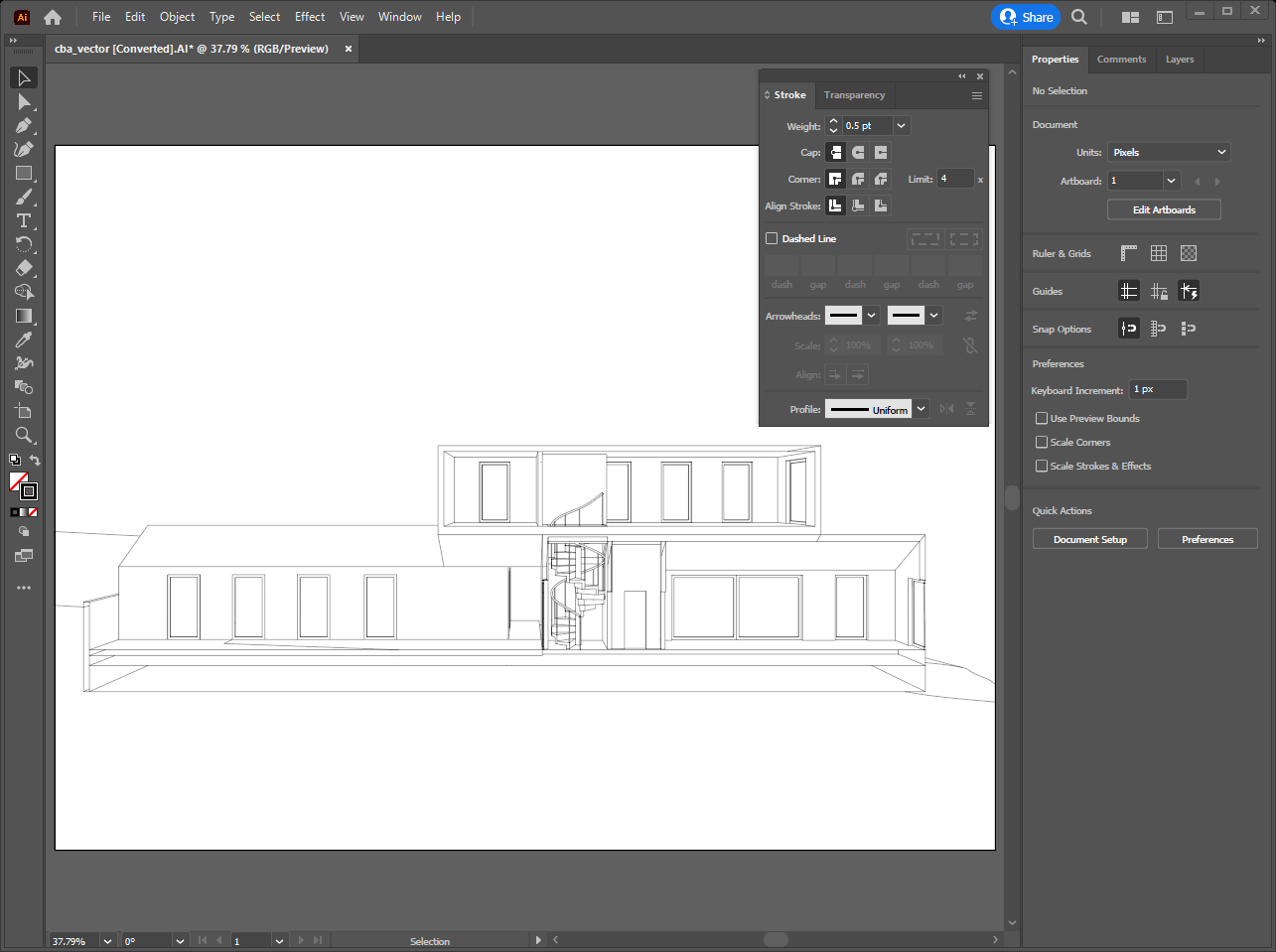
Next I'm going to give a style to my section cut. After turning off the "Visible curves" layer. select the curves that are left and use the Shape Builder tool (Shift + M) to create closed regions we can fill in (it works kind of like CurveBoolean in Rhino).
I'm filling the cut with a diagonal hatch (only where it cuts the building, not the ground). For this I'm using a built-in pattern from Swatches >> Patterns >> Basic Graphics >> Basic Graphics_Lines, then transforming the pattern only to rotate and scale it. At the end I have this:

If you're familiar with Illustrator, you know that there are lots of places you could go from here. You could use Live Paint to fill in colors and patterns, add vector scale figures and text, add more variation to your line weights, and so on.
For more practice, try using Illustrator to style one of the isometric or axonometric drawings from the Projection tutorial. Can you make a strong vector image with no "lines," only solid colors with the Live Paint tool?
Combining Vector & Raster Images
Sometimes we want a drawing that combines vectors and raster images. For instance, maybe we want to use the drawing we composited together in Photoshop as an underlay for this one.
Create a new layer underneath everything in the file already. With that selected, go to File >> Place and navigate to your PSD file, and place it on your artboard.
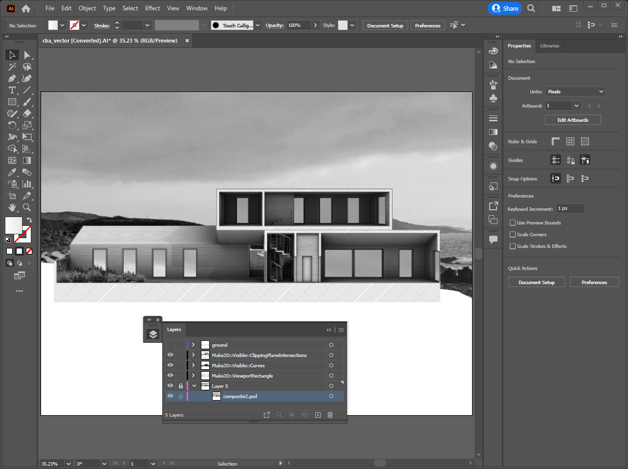
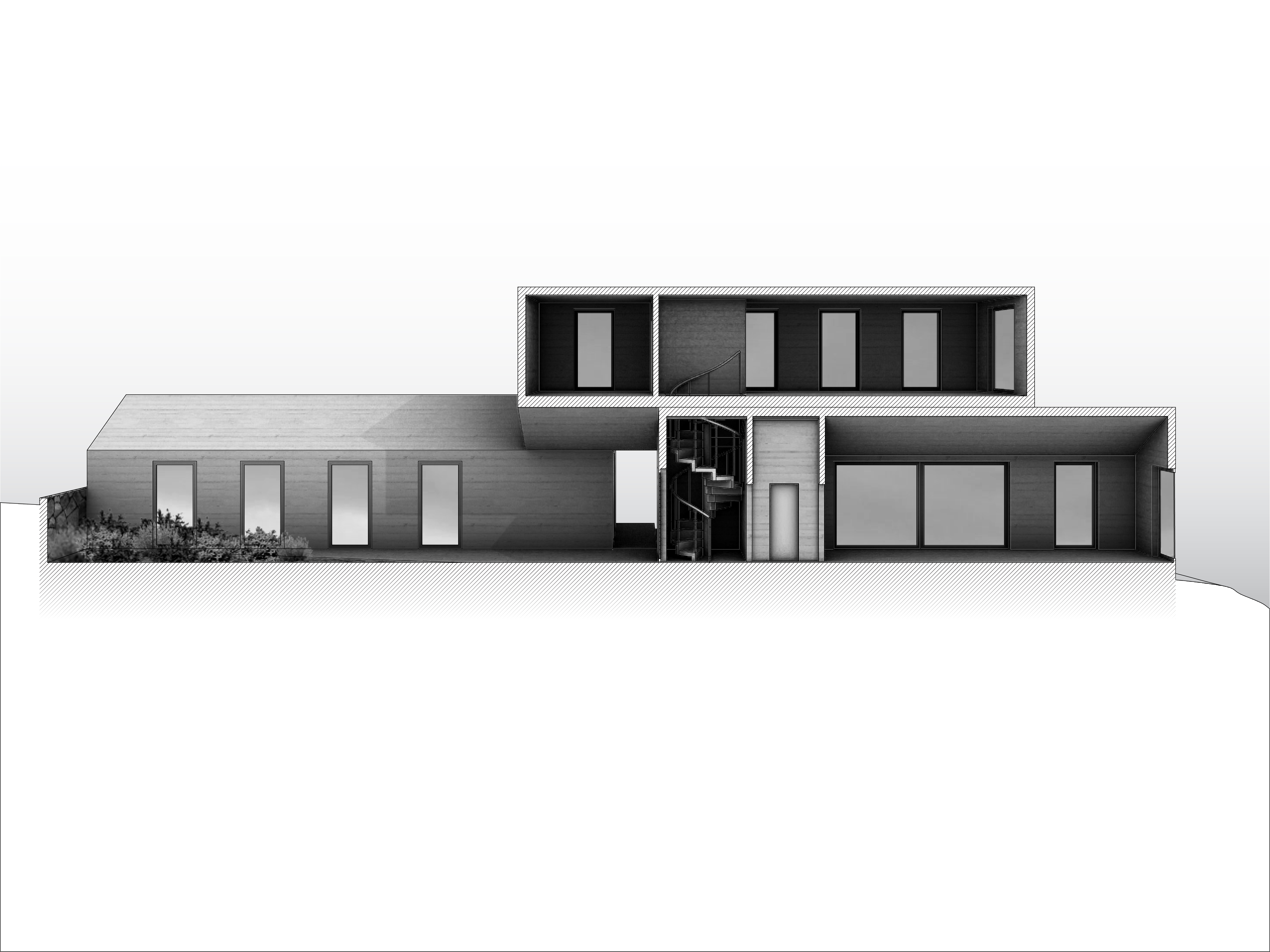
Placing a file like this allows you to work in raster and vector in parallel, since updates to the Photoshop file will be reflected in Illustrator. (It's also possible to do the reverse, placing an .ai file in Photoshop as a "Smart Object.") in the image below, I've masked out the background of the image with a subtle gradient to foreground the clean vector lines of the drawing.
Post-Sequence Challenge: Drawing an Argument
As a final challenge to wrap up this sequence, take the building you modeled for the Sequence 12 challenge and create two drawings of it:
- A section perspective, like we the one we made above.
- An "exploded" axonometric, which pulls apart the pieces of the project in order to explain it.
Be delibrate about these drawings.
- What specific argument or point-of-view about the building do you want to advance?
- What camera angles, section cuts, and projection types make this point most clearly?
- How can color, texture, and other stylistic decisions reinforce your idea?

