Spatial Analysis - Point Patterns
Module Summary
In this module we discuss analytic methods commonly used to interrogate spatial data, namely, point pattern analysis. Point pattern analysis concerns the spatial arrangement and distribution of things in geographic space. For example, we might consider the location of trees in NYC and ask: Are trees equally dispersed throughout the city (point pattern analysis)? Or, are there regions within the city with higher densities of trees? Point pattern analysis helps us answer these questions quantitatively and visualize or describe them statistically.
We will extend some of the topics explored in the previous module on geospatial data, that of discretization, to develop new methods for characterizing spatial phenomena. Again, we will be using the GeoPandas and Shapely libraries to manipulate geometric and geographic data in Python.
For this module we will be using the Pandas, GeoPandas, Matplotlib, Seaborn and Shapely Python libraries. Ensure to pip install them on your machine, if you don't already have them, and import like so:
import pandas as pd
import geopandas as gpd
import matplotlib.pyplot as plt
import seaborn as sns
from shapely.geometry import Point, Polygon
import numpy as np
import contextily as cx
Point Pattern Analysis
Points in the context of spatial data usually take one of two forms. 1) Points can represent a spot measurement taken from a larger continuous process – for example, when measuring temperature in an urban environment, the temperature is recorded at a particular latitude longitude where the sensor is located. Here the location of points could take place anywhere, but is generally limited to few locations that are determined by the cost of sampling or the desired resolution of gathering readings. 2) Points can also represent a fixed object in space, say, a location of trees or the location of a schools in a city. Points in this context usually are driven by some underlying process that makes their location not random. It is this latter event that we will be concerned with for point pattern analysis. Our goal in point pattern analysis is to determine the underlying process as to why the particular object or event occurred where it did. To stick with the NYC tree census example, we might ask: is there a pattern to the location of trees? why are there trees in some places and not in others? We could ask these same questions for practically any object you find in cities or rural communities.
We will introduce concepts of point pattern analysis sticking with the 2015 NYC tree census data. To get started let's load the data into a Pandas DataFrame:
path = 'data/2015_Street_Tree_Census_-_Tree_Data.csv'
df = pd.read_csv(path)
As we loaded the data from a .csv we will next need to convert this to a GeoDataFrame so that we can easily visualize and manipulate the data spatially. To do that we will create a function to convert the 'latitude' + 'longitude' columns (float values) to a Shapely Point object (a geometry class in Python). The function will take an input called data and return a Shapely object. We will make use of .apply functions in Pandas to conveniently iterate over the entire DataFrame:
def lat_lng_to_point(data):
    return Point([data['longitude'], data['latitude']])

df['geom'] = df.apply(lat_lng_to_point, axis=1)
You should now see an extra column in the DataFrame called 'geom' that consists of Point objects:
df['geom'].head()
0    POINT (-73.84421522 40.72309177)
1    POINT (-73.81867946 40.79411067)
2     POINT (-73.9366077 40.71758074)
3    POINT (-73.93445616 40.71353749)
4    POINT (-73.97597938 40.66677776)
Name: geom, dtype: object
Now we are ready to convert the DataFrame to a GeoDataFrame with geographies. To do this we need to tell GeoPandas what column contains geometries and the CRS we want to use for projection (we will first use a common CRS projection):
gdf = gpd.GeoDataFrame(df, geometry='geom')
gdf.crs = 'EPSG:4326'
Now let's visualize the data! To do so we will first filter the GeoDataFrame to only show trees in Manhattan. We can use the 'zip_city' column and add a condition that only includes rows that are in 'New York' (AKA the Manhattan borough). Notice that we specify the marker and figure size (with the figsize + markersize arguments) in order to increase the resolution of the plot:
gdf.loc[gdf['zip_city']=='New York'].plot(figsize=(12,14), markersize=0.25)
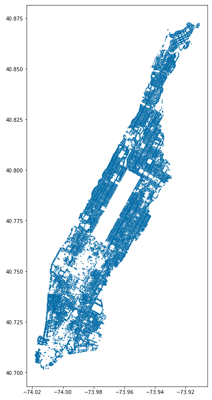
Although we can make out the shape of Manhattan, the tree locations by themselves appear as dots in arbitrary whitespace, lacking geographical context. Luckily, adding context in GeoPandas is fairly easy with the contextily Python library. Contextily works by loading Web map tiles into the GeoPandas plot. Web map tiles are usually provided in a certain CRS projection, EPSG 3857, so we will have to update the CRS of our GeoDataFrame to match:
# change the CRS
gdf = gdf.to_crs(epsg=3857)

ax = gdf.loc[gdf['zip_city']=='New York'].plot(figsize=(12,14), markersize=0.25)
cx.add_basemap(ax, source=cx.providers.Stamen.TonerLite)
ax.set_axis_off()
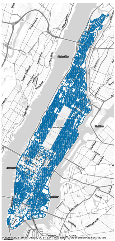
The above plots do not tell us much about the structure of points across the city however, the amount of points on the map hide the underlying distribution not revealing whether some areas have a higher concentration than others. One way to get around this is to use polygons or an underlying grid to bucket the points into regular regions and then count the number of points within each region. This is similar to the use of histograms to visualize the distribution of numerical data.
To create the grid in GeoPandas we will use the x + y bounds of the tree dataset to define our overall region, and subdivide this region into grid cells (giving each cell a unique identifier to help with analysis):
# filter the tree dataset to only those within Manhattan
manhattan_trees = gdf.loc[gdf['zip_city']=='New York']

# get the outer bounds of the points
xmin, ymin, xmax, ymax = manhattan_trees.total_bounds

# specify the number of cells along x + y axis
x = 40
y = 80
wide = abs(xmin - xmax)/x
length = abs(ymin - ymax)/y

# create a list of points that will define grid corners
cols = np.arange(xmin, xmax + wide, wide)
rows = np.arange(ymin, ymax + length, length)

# iterate over list of corners to create Shapely Polygon objects
polygons = []
for x in cols[:-1]:
    for y in rows[:-1]:
        polygons.append(Polygon([(x,y), (x+wide, y), (x+wide, y+length), (x, y+length)]))

grid = gpd.GeoDataFrame({'geometry':polygons, 'cell_id': list(range(len(polygons)))})
grid.crs = 'EPSG:4326'
Then we will merge the grid cells with our trees, count the number of trees within each cell and visualize the results:
# merge the two datasets
grid_trees = gpd.sjoin(grid, manhattan_trees)

# count the number of trees in each cell
grid_tree_count = grid_trees.groupby('cell_id')['tree_id'].count()

# rename the column for convenience
grid_tree_count.rename('tree_count', inplace=True)

# merge the two tree counts with the grid GeoDataFrame and plot
grid.merge(grid_tree_count, on='cell_id').plot(
  column='tree_count', figsize=(12,14), edgecolor='white')
cx.add_basemap(ax, source=cx.providers.Stamen.TonerLite, crs='EPSG:4326')
ax.set_axis_off()
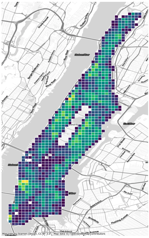
Discretizing points into grids is a fast and efficient way of describing density across regions. But it suffers from the loss of information that comes with binning the data. Another approach is that of Kernel Density Estimation (KDE). KDE is a common tool in statistics and machine learning, often used to describe the continuous distribution of data using "kernels". In the context of our tree data, KDE visualizes the density of trees using contours to indicate higher concentrations, giving us a method for visualizing the density of points across the city without having to buckets the data into grids.
We will implement Kernel Density Estimation using Seaborn, a Python library for data visualization. Seaborn has a .kdeplot() function that takes as input the x + y coordinates of our point data and a color map (specifying the underlying color of the visualization):
# create the base layer on which will go the KDE and mapping context
_, ax = plt.subplots(1, figsize=(12, 14))

# use Seaborn to plot KDE
sns.kdeplot(
    manhattan_trees['longitude'],
    manhattan_trees['latitude'],
    cmap='viridis',
    shade=True
)

# add context
cx.add_basemap(ax, source=cx.providers.Stamen.TonerLite, crs='EPSG:4326')
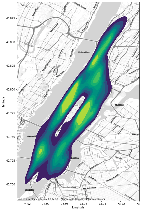
Compared to the use of grids and binning our data, KDE provides a smoother gradient (via contours) to indicate higher and lower concentrations of trees – here the yellow areas have higher concentration.
Challenge
Download the NYC points of interest dataset and explore their density throughout the city.

