Orthographic Drawing: Plans & Sections
Module Summary
In this module we'll introduce the two most essential types of architectural drawing: the plan and the section. We'll give a brief overview of what these drawings are and how they work, and then see how to create them from a Rhino model.
What is Orthographic Drawing?
Plans
The most familiar kind of architectural drawing is the plan. As you probably know, a plan depicts a space as if you were looking down at it from above. Since humans mostly move around the world in the horizontal plane, this tends to be the single most useful drawing for explaining a design.
Contemporary plans usually follow an explicit set of conventions, so that they can include lots of information while still being legible and unambiguous.
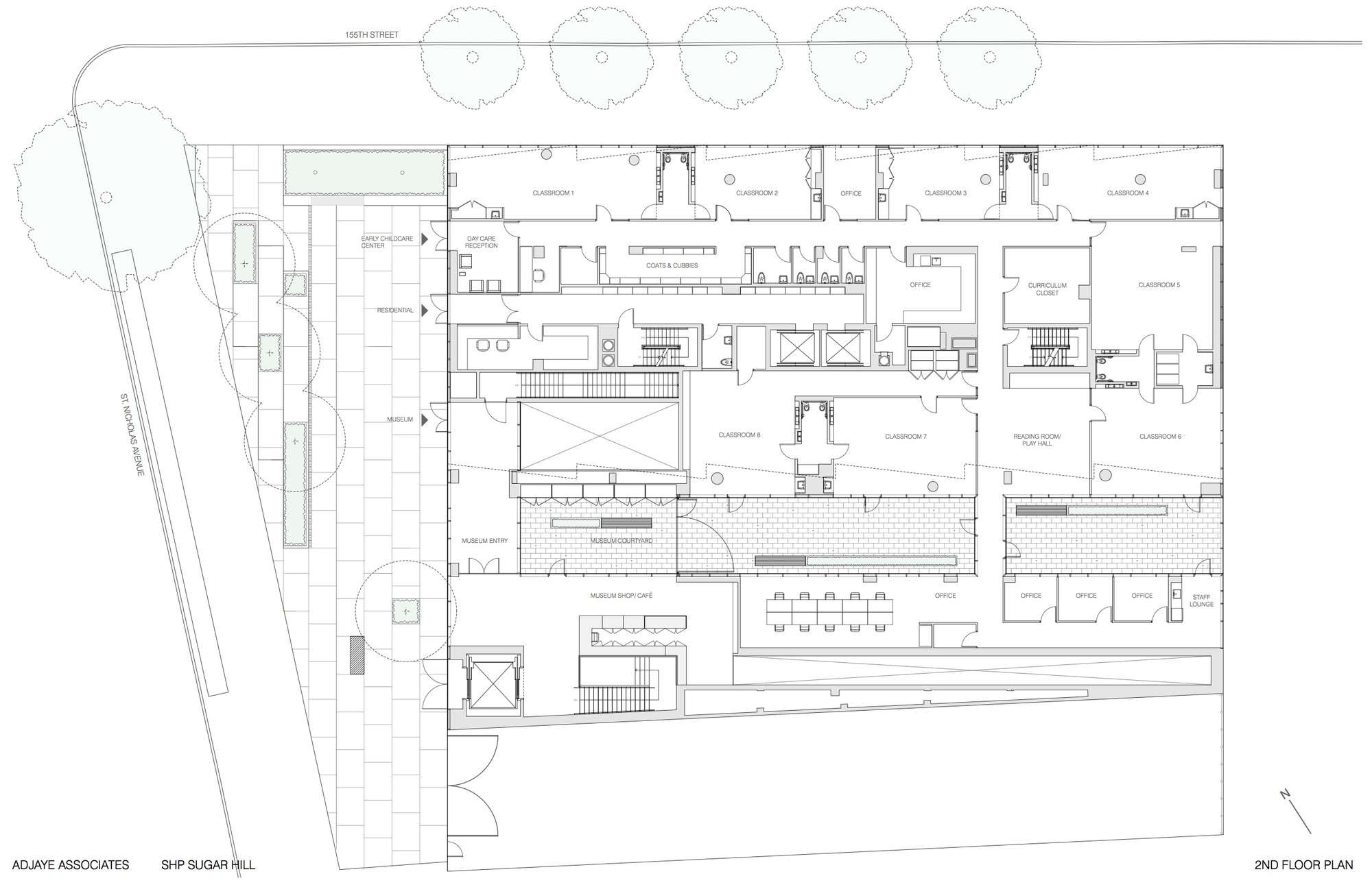
We imagine that an infinite, invisible horizontal plane intersects the building, hiding everything above it. This plane is usually 4'-0" above the floor, since this height tends to capture things like doors and windows, while still being above elements you can see over, like tables and counters. Things which are "cut" are represented differently from the rest of the plan, so you know what parts of the drawing to take literally. Lines are drawn thicker, and solid areas like walls are filled in with a poché (po-shay) that can be either solid or patterned. Other conventions exist for describing doors, stairs, slopes, and elements that are important but either hidden behind other objects or on the wrong side of the "cut."
Sections
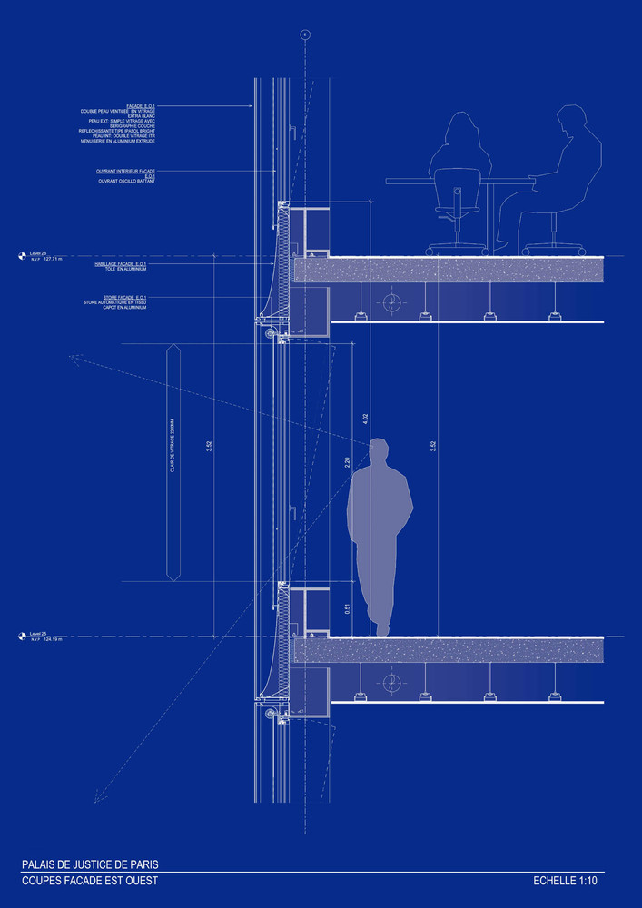
A section is like a plan, but the plane which cuts the building is vertical rather than horizontal, allowing us to look at the interior of the building "face on."

The placement of section cuts is less strictly dictated by convention than that of plans, but the cutting plane typically aligns with one of the main axes of the building. If the building is symetrical, as in the example above, then the section would be expected to cut through the center. A contemporary section might look like this:

One of the most common uses of section drawings in architecture today is to describe technical assembly of things like walls and windows, in detail drawings.
Orthographic Drawing
These two types of drawings, the plan and section, are called orthographic drawings (though this term sometimes refers to any drawing depicting space through mathematical projection). They show the flat planes of a space as seen straight on, without representing depth or volume. This limits what they can show, but makes what they do represent extremely consistent and dimensionally unambiguous. Let's look at how to make them in Rhino.
Tutorial
Setting up the Plan
In this tutorial we'll be making drawings using the model of the Casa Bahia Azul which we created in the Introduction to Rhino sequence. You'll notice that I've added more detail to the interior of the model. I encourage you to try building out your interiors as well, but if you only have what was directly covered in those tutorials you'll still be able to follow along.

To make our floor plan, we first need to cut our model at 4'-0" above the floor. Rhino has objects called Clipping Planes that allow us to do this in the viewport, without permanently affecting the geometry in our model. Make a "Clipping Plane" layer, activate it, and then use the ClippingPlane command. You'll be prompted to draw a rectangle. Clipping planes extend indefinitely regardless of their size or position, so draw it anywhere.
You'll see that everything above the Clipping Plane is now hidden, and the places where it cuts your model are marked with heavy lines. Now move the plane up to the height at which we want to "cut" our plan, 4'-0" (or 1.2m).
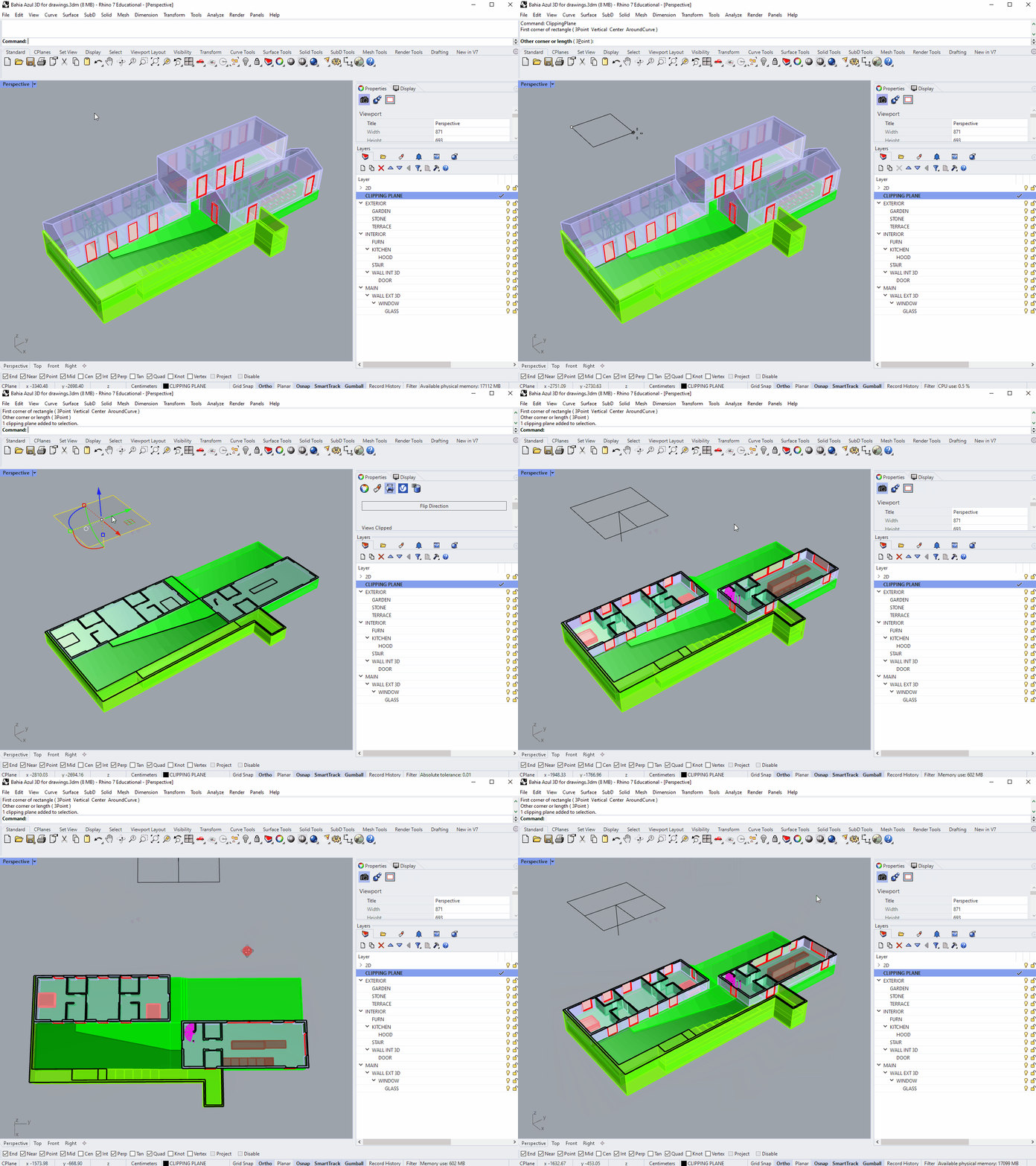
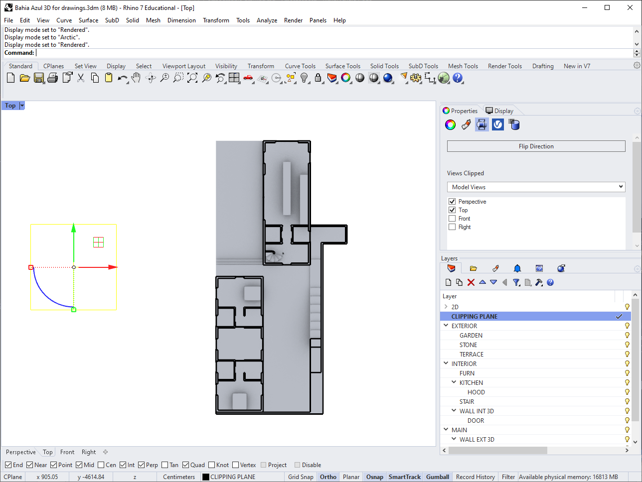
What we're looking at now is a 3D version of our floor plan. Switch to Top view to look at it straight on (or orthographically), and you'll see that your Clipping Plane is no longer active. Click on it, go to the Properties panel, and check the box next to "Top" to fix this.
For a quick sense of how your plan will come out, try looking at it in the "Technical" display mode. You might also check it out in "Rendered."
Creating the Linework
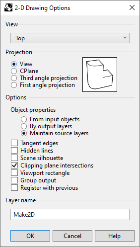
Next we'll create the lines for our floor plan. Drag a window around your entire building to select all the geometry. To convert these 3D objects to lines, Rhino has a command called Make2D. Use it now, and you'll be presented with some options. We're going to use "View" for our projection, "Maintain Source Layers" for object properties, and check the box for "Clipping Plane Intersections." Hit OK to complete the command.
Your line geometry will now be created near the origin of your Rhino space (move it out of the way if it overlaps with your model). You'll also have a lot of new layers in the layers panel, nested under "Make2D." The two main categories are "ClippingPlaneIntersections" (lines where the model and clipping plance intersect), and "Curves" (everything below the clipping plane).
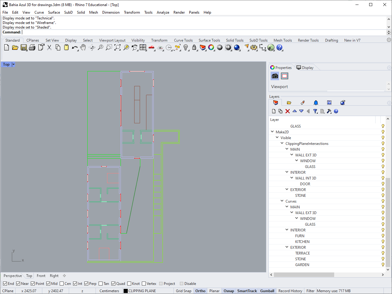
We're going to treat all of the intersection lines the same no matter what they cut through, so right-click on the "ClippingPlaneIntersections" layer, choose "Select Sublayer Objects," and move them all onto this top-level layer. Notice that this Intersections layer was created with a "Print Width" of 0.5, rather than "Default," but also that in your viewport it has the same thickness as everything else. Use the PrintDisplay command and toggle "State" to "On" to preview your lineweights in the viewport.
We do want do do a little clean-up on this plan before making it into a drawing. First, at 4'-0" above the ground our clipping plane cuts through the long shallow steps connecting the building to the driveway. This cut line is technically accurate, but doesn't produce a very useful description of the entry sequence. So I'm going to clean up the bottom left corner to fill in the stairs that were above the cut line.
This raises questions about how we're going to treat this outer retaining wall. We could represent it as a solid, the same as the walls of the house, but it's actually only partial-height; you can see over it. We could assign a weight or fill to represent a partial-height obstacle, but since the steps create a gradual transition between levels, there's no natural place to draw that boundary. So for simplicity, I'm going to move the entire retaining wall and steps to an ordinary, non-intersection layer.
Depending on how you put your model together, you may have some lines in your Make2D where two pieces of geometry meet, but which don't actually represent anything physical. This is a good time to delete those as well.
Hatches and Fills
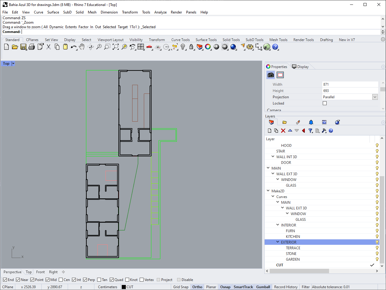
Using a heavy line is one way to indicate where a plan drawing has been cut, but we want to fill the areas inside the walls with a solid color to distinguish them from the floor and make the drawing easier to read. In architectural drawing, the fill used to represent cuts through solid material is called poché (pronounced po-shay). We could fill in our solid walls light grey with a heavy outline, or assign patterns to represent the different materials being cut through, but for a simple plan like this a plain black poché will be fine.
To create solid fills, we need their outlines to be closed curves, not the unconnected line segments we get from using Make2D. Turn off the "Curves" layer, leaving only your cut lines visible. Select them all, and use CurveBoolean to create closed regions (doing this by clicking the "open" areas will produce the same results, and take less time). You can toggle on the option to delete all input curves, since we won't need them after this.

Now we have closed curves enclosing the areas we want to fill in. Annotative fills in an architectural drawing are called hatches, and sometimes use patterns to symbolize different materials, but we're just going to use a solid color.
Make a layer for your hatches, nest another layer called "Solid" under it, and activate it. Then select your new closed curves and use the Hatch command. "Solid" is the first option in the list and will be selected by default, so hit enter.

Let's create one more hatch to represent the garden, since this area has a distinct character than the rest of the plan and can't be walked through. Since it's just one zone, we'll create the hatch directly without generating the boundary first. Use hatch again, but this time set "Boundary" to "Yes" in the command prompt. Then select your entire drawing, hit enter, click inside the garden, and hit enter once more to bring the hatch dialog back up.
Rhino only comes with a few hatches pre-installed. You can download more from McNeel here, and find others by searching online, but we'll just use the built-in "Plus" hatch. Set the scale to 25 and the rotation to 45 degrees, then click 'OK'.

Layout
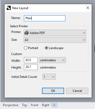
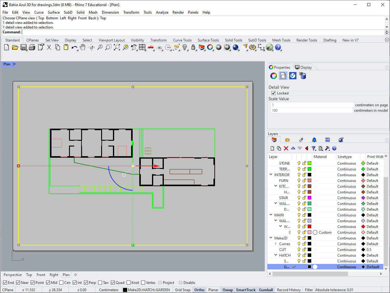
Before we do anything else to this plan, let's set up a page for it and figure out what scale it should be. To create a new page layout, click the '+' to the right of the viewport tabs at the bottom left of the screen. Make an A3 layout in landscape format, called "Plan".
You'll see a page with a "Detail View" of your model from the top.
Now we want to rotate our plan 90 degrees so it fits nicely on our landscape-oriented page, but rather then changing our actual geometry, let's just change the way we look at it on this page. We do this by changing the Construction Plane, or CPlane. Creating a CPlane lets us define a new coordinate system, moving the origin of our model and rotating the X, Y and Z axes. You've actually already moved between CPlanes, when switching between Top, Front, and Right views; each of these has its own coordinate system, letting you draft in different orientations.
Double-click in the Detail View to enter your model space, zoom in to your floor plan, and use the CPlane command. Choose "3Point" in the command prompt, and click near the bottom-right corner of your building to set the origin of your new coordinate system. Next you'll be prompted to set the direction of the X axis. We want this CPlan rotated 90 degrees, so instead of being to the right, we want X to be "up", in what's normally the Y direction. Click somewhere "above" your new origin to set the X axis, and then hit enter to accept the default Y direction (which will now be pointing to the left).

So far the only thing that has visibly changed is the grid representing your CPlane, with its red and green lines for the X and Y axes. To rotate your view to match the CPlane, use SetView, and choose "CPlane" in the command prompt, followed by "Top."

Center the drawing on the page, then, with the Detail View itself selected, go to the properties panel to set its scale to 1:100, and finally lock it so you don't make any accidental changes.
Styling the Drawing
Now lets get this looking like a real drawing. For an accurate preview of what the drawing will look like, use PrintDisplay again, and set it to "On" (the last time we used this it only affected our viewports, not our layouts).
To make all our lines black we can change the Print Colors of our layers, without affecting the display colors. Print colors are represented by a lozenge shape (◆) in the layers panel. If you select all the layers under "Make2D", click the diamond next to one of them, and set it to black, the print colors of all those layers will be changed.

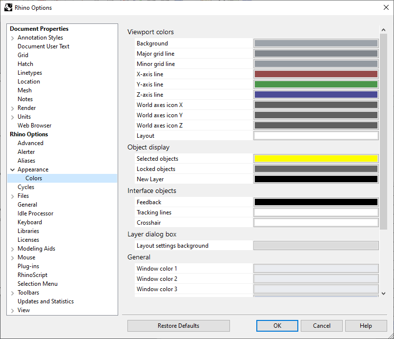
To change the display color of the page, go to Options, and under Appearance >> Colors change the Layout color to white.
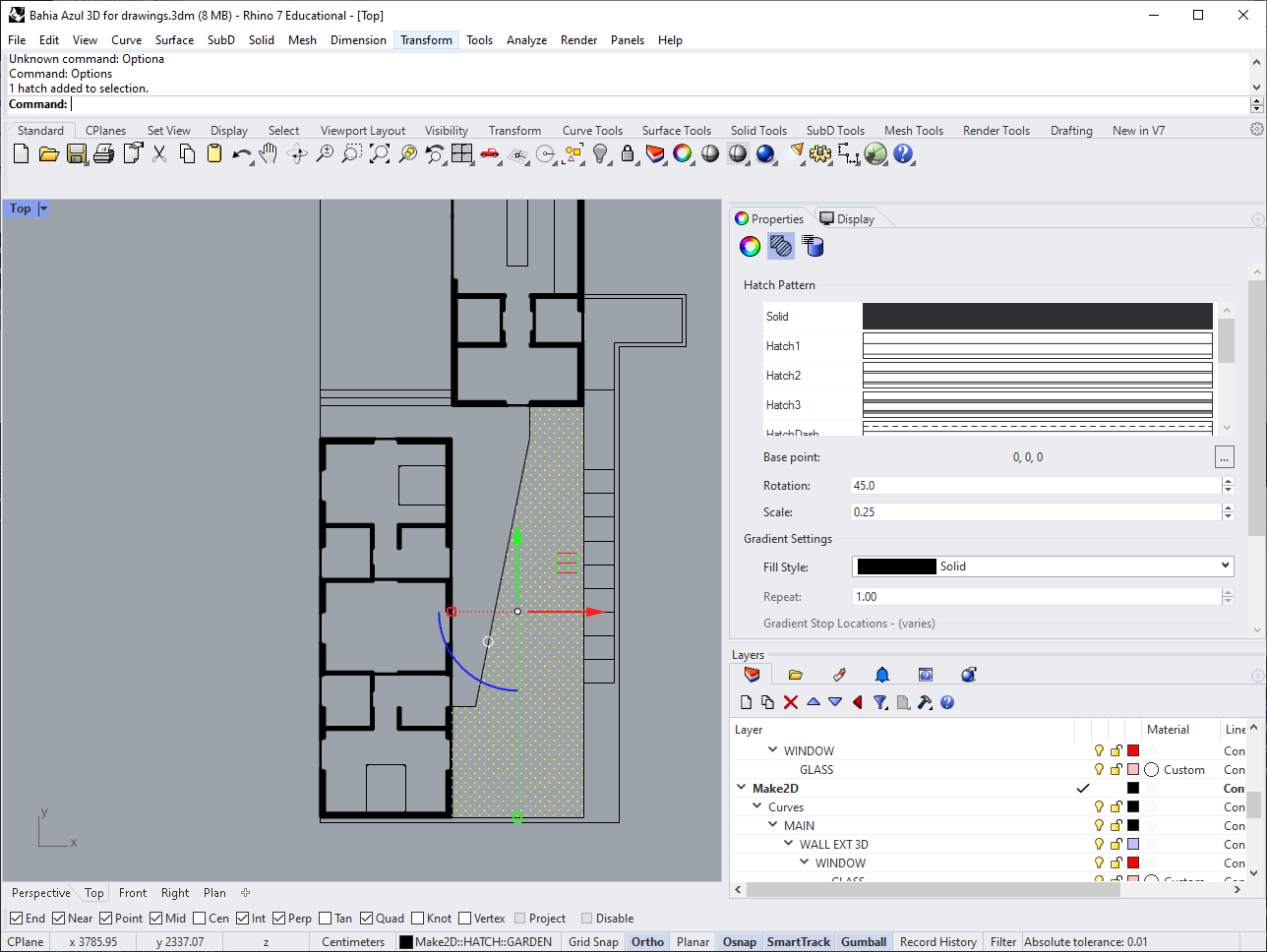
You'll notice that the hatch we created for the garden isn't showing up in our drawing. That's because right now the hatch scale in both model-space and paper-space is the same, meaning it's so big that all we can see is the empty space between "+" marks. Go back to "Top" view and select the hatch. Then, in the Properties panel, go to Hatch Properties. Change the scale from 25 to 0.25 (since our drawing is at 1:100 scale).
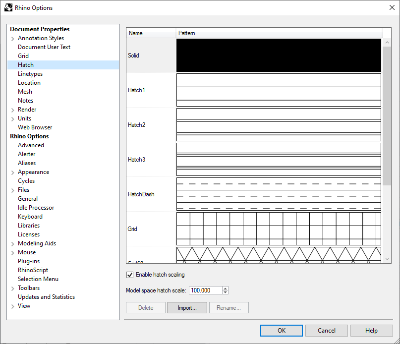
This fixes the hatch in the page layout, nut now it looks wrong in model-space. Fix this by going back to Options, and under "Hatch" set the "Model space hatch scale" to 100.
Your Plan page layout should now look like this:
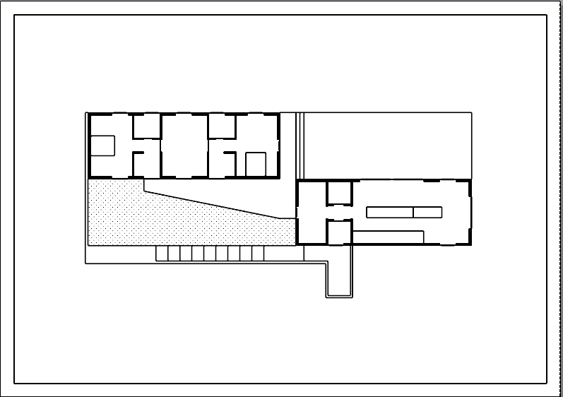
Let's add a little more information. For one thing, because we only included things below our clipping plane, the upper volume doesn't appear anywhere on this plan. But it's an important enough feature that we probably want to indicate it somehow. Using the original 2D geometry you created from the reference drawings, add a rectangle to this plan indicating the outline of the upper level. Put it on a layer called "Above," and change the linetype of the layer to "Hidden". This is how we'll distinguish it from geometry below our cut plane. (Right now the line won't look dashed in model space, for the same reason our hatch was wrong before. To fix this go to options again, and under Linetypes, change the Linetype Scale to 100.)
Now our drawing has a dashed line for the upper floor.
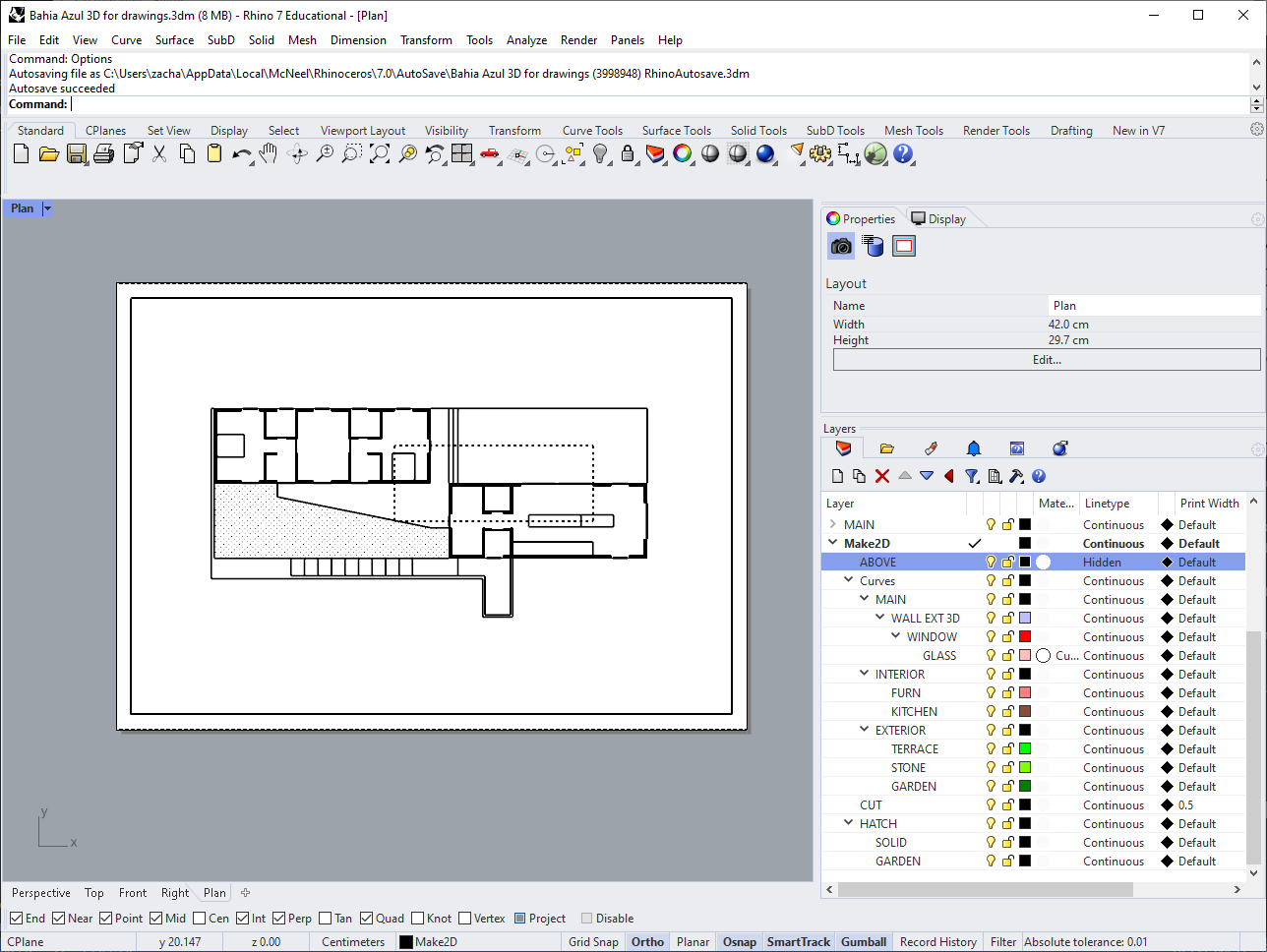
Let's do a little work on our line weights. Our Clipping Plane Intersection lines are still heavy, but since we've filled them in with black this isn't necessary anymore. In the Layers panel, change this layer's "Print Width" to "Default". You can also change the print width of your garden hatch layer to "Hairline".
Dimensions & Annotations
Lastly, we'll mark some dimensions on this drawing and add a title. Make a new "Annotation" layer, with "Dims" and "Title" sublayers. Then, on the "Dims" layer, use the Dimension command to mark the width of the dining room volume.
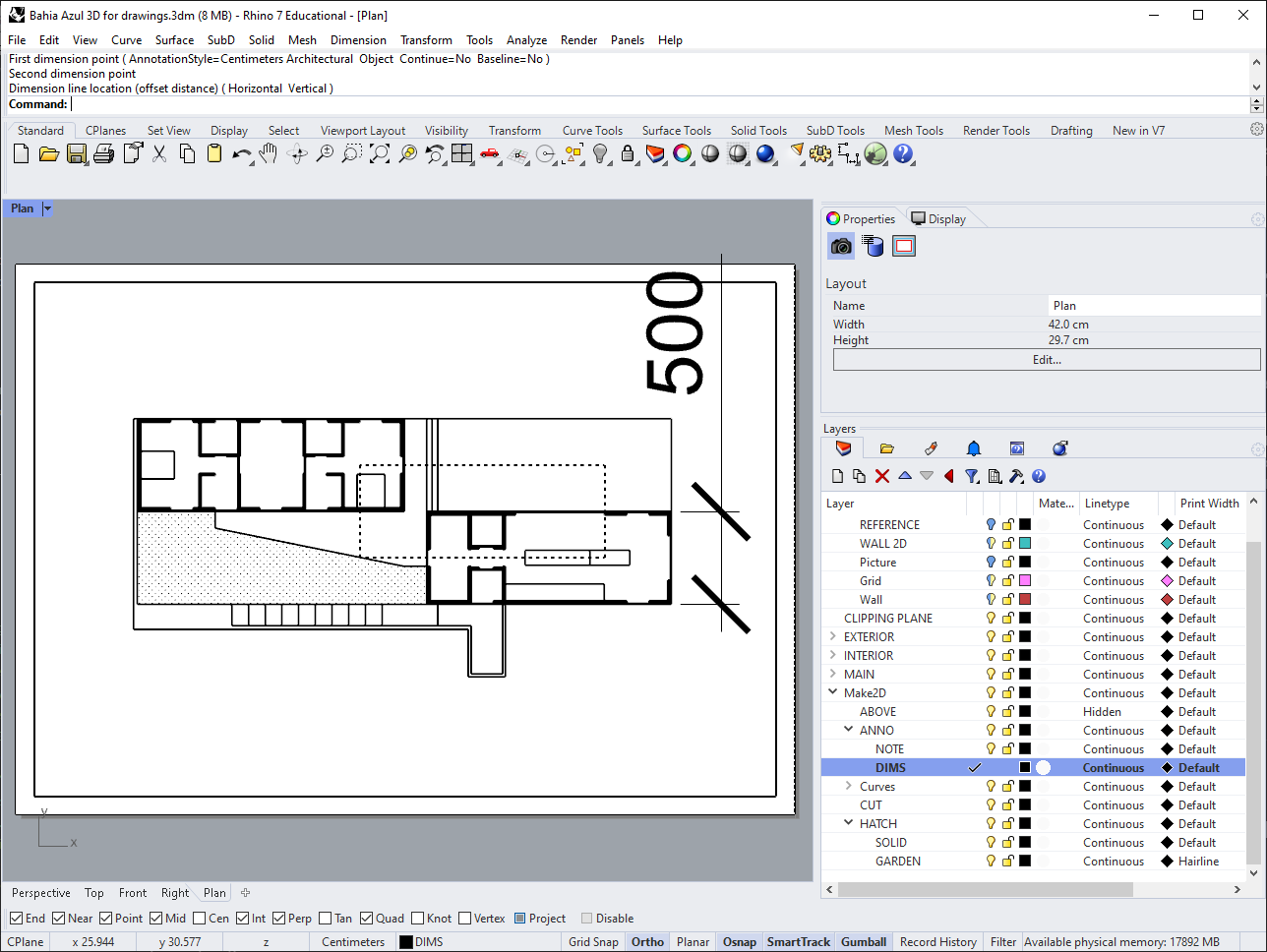
This is clearly way too big for our page, so we have to set up a new annotation style. Back in options, go to "Annotation Styles," click "New," and choose the built-in style "Template Model Units Decimal."
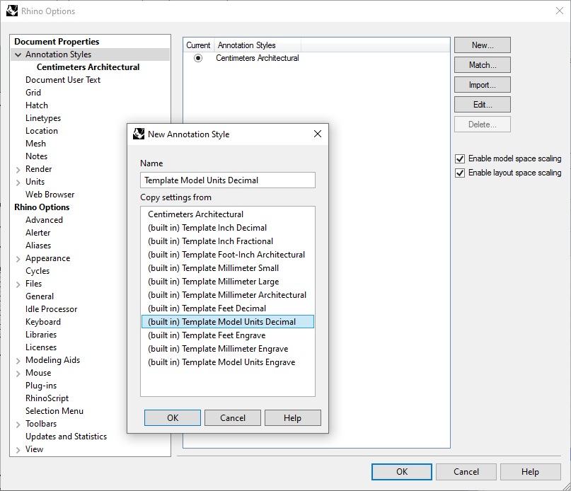
You can assign this new style to the dimension you just drew using the Properties panel. You'll see that it's better, but too small. Using "Edit Style" (again in the Properties panel), double the size of the text, text gap, and arrows. You can also change the resulution to whole numbers, since fractions of a centimeter are too small to worry about in this drawing.
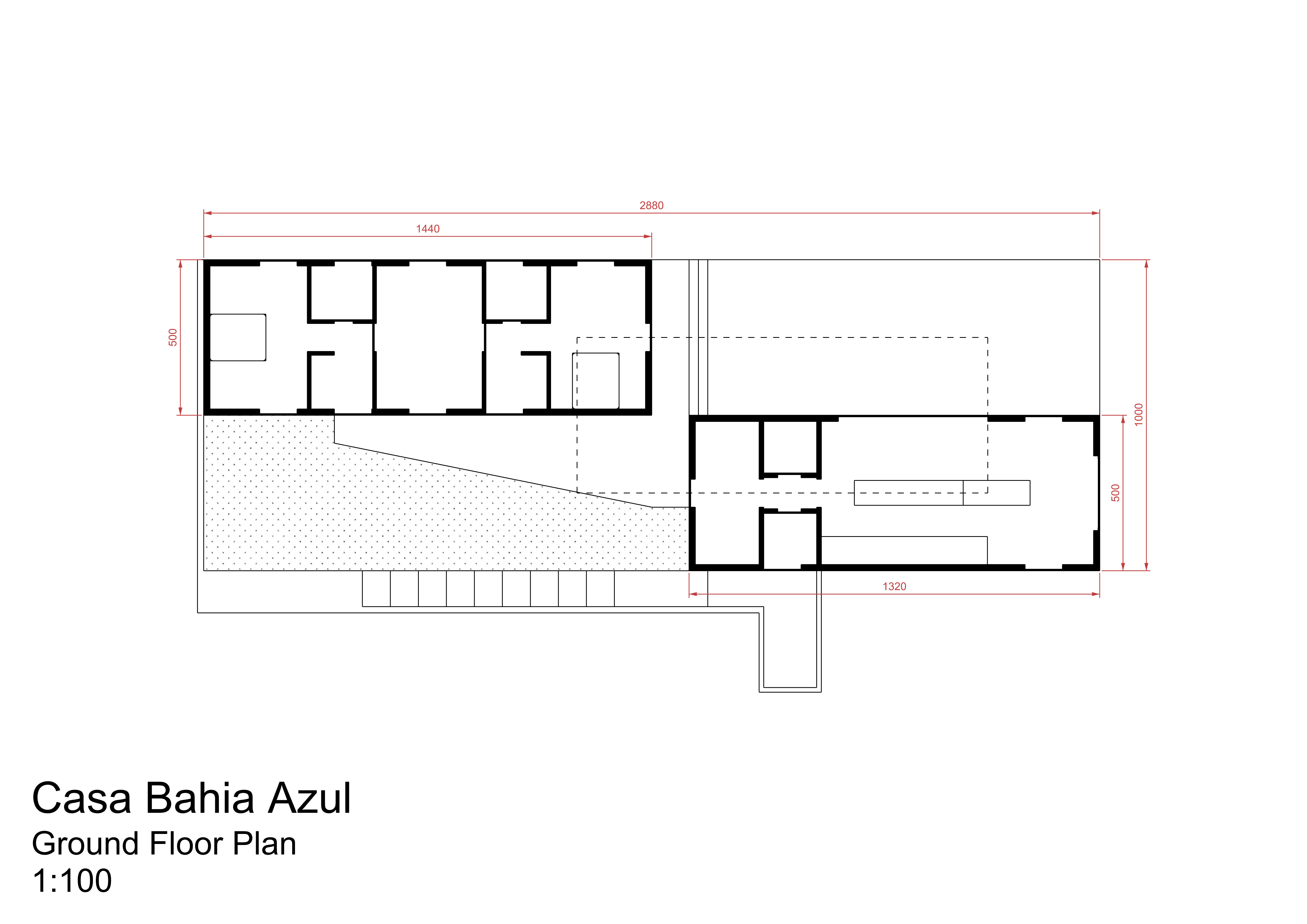
Now you can finish adding dimensions to the rest of the drawing, using this same annotation style. In the drawing below I've also changed the print color of the Dimensions layer, to help distinguish them from the plan.
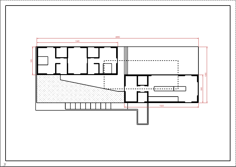
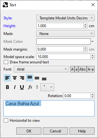
Finally, add labels with the project name and scale of the drawing, using the Text command.
To make a PDF of this drawing, use Print. Select "Rhino PDF" as the printer. The preview you see now has accurate lineweights, and you can set the "Default" line width here to fine-tune your output (you may end up creating and checking a few PDFs until you have it just right).

When you're done, hit "Print" to export your final drawing.
Drawing a Section
An orthographic section drawing is conceptually very similar to a plan, with the difference that the plane which cuts through the building is oriented vertically instead of horizontally.
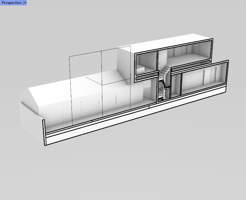
Back in your perspective viewport, disable the Clipping Plane you created for your plan, and hide it. Then create a new one, choosing "Vertical" in the command prompt. Unlike a plan, which by convention is usually cut at the same height above the floor, we have a lot of discretion in choosing where to cut our section. If a building is laid out with right angles, like this one is, we expect the section to be cut along either the X or Y axis, but otherwise the question is what parts of the building we most want to reveal.
I've chosen a section cut which crosses through both the dining and upper-level spaces of the house, showing the staircase which connects them, and which also includes the guest house volume in front of the clipping plane. This seems to me like the best way to capture all the major elements of the building in a single drawing.
From here, we can follow all the same steps as before to create our section drawing. This time around, experiment more with hatches and lineweights.
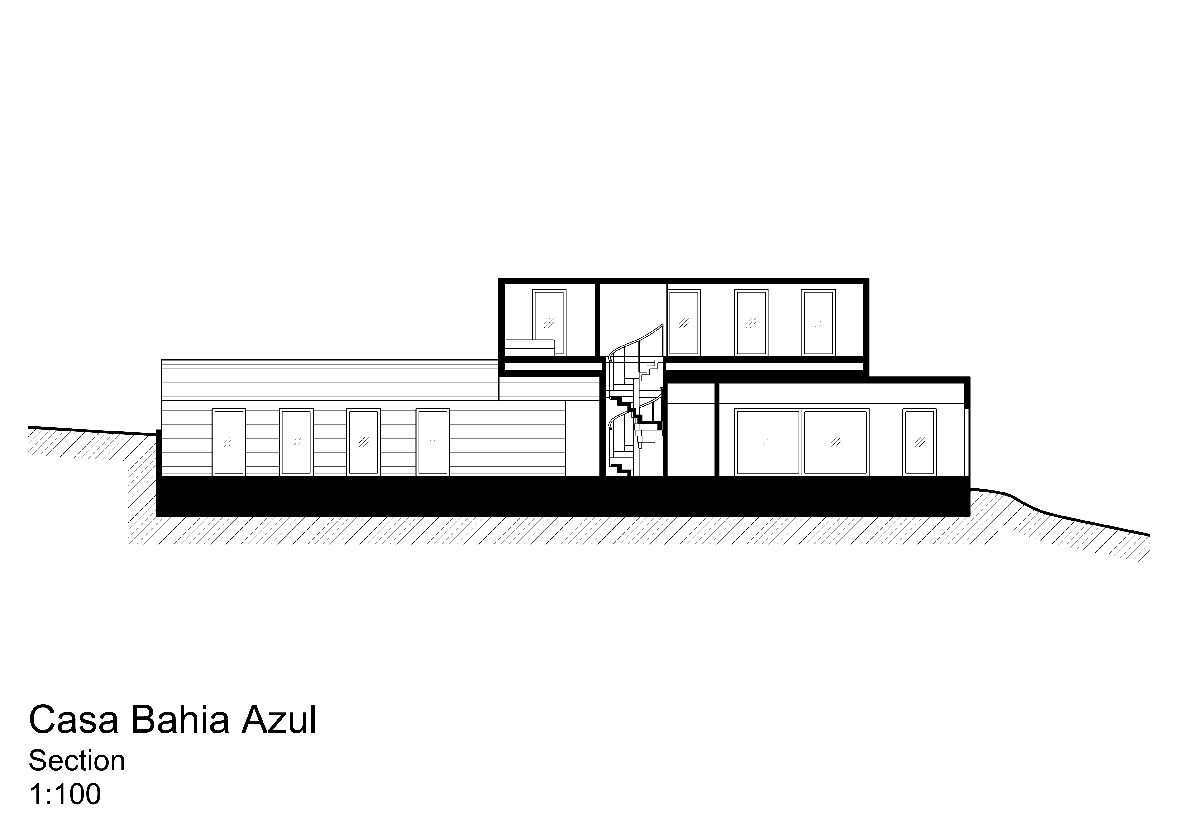
For more practice after completing these two drawings, try a second-floor plan and a section cut in the other direction.
Conclusion
In this tutorial, we learned how to create an orthographic plan and section. In the next one, we'll look at projecting 3-dimensional space onto a 2D page.

