Modeling with NURBS
Module Summary:
We were able model the Casa Bahia Azul using simple extrusions made of straight segments, but Rhino is capable of much more than that. This module introduces the use of freeform curves and surfaces in Rhino. It starts with a quick overview of how geometry was described in the past, and how it's done in Rhino, followed by a freeform modeling exercise, and finally explores creating the terrain surrounding the Casa Bahia Azul.
A Brief History of Architectural Geometry
The primary system Rhino uses to describe geometric objects is called NURBS, which is short for Non-Uniform Rational Basis-Splines. To understand what that means, let's look briefly at how architects have used geometry in the past.
I. Euclidean Geometry
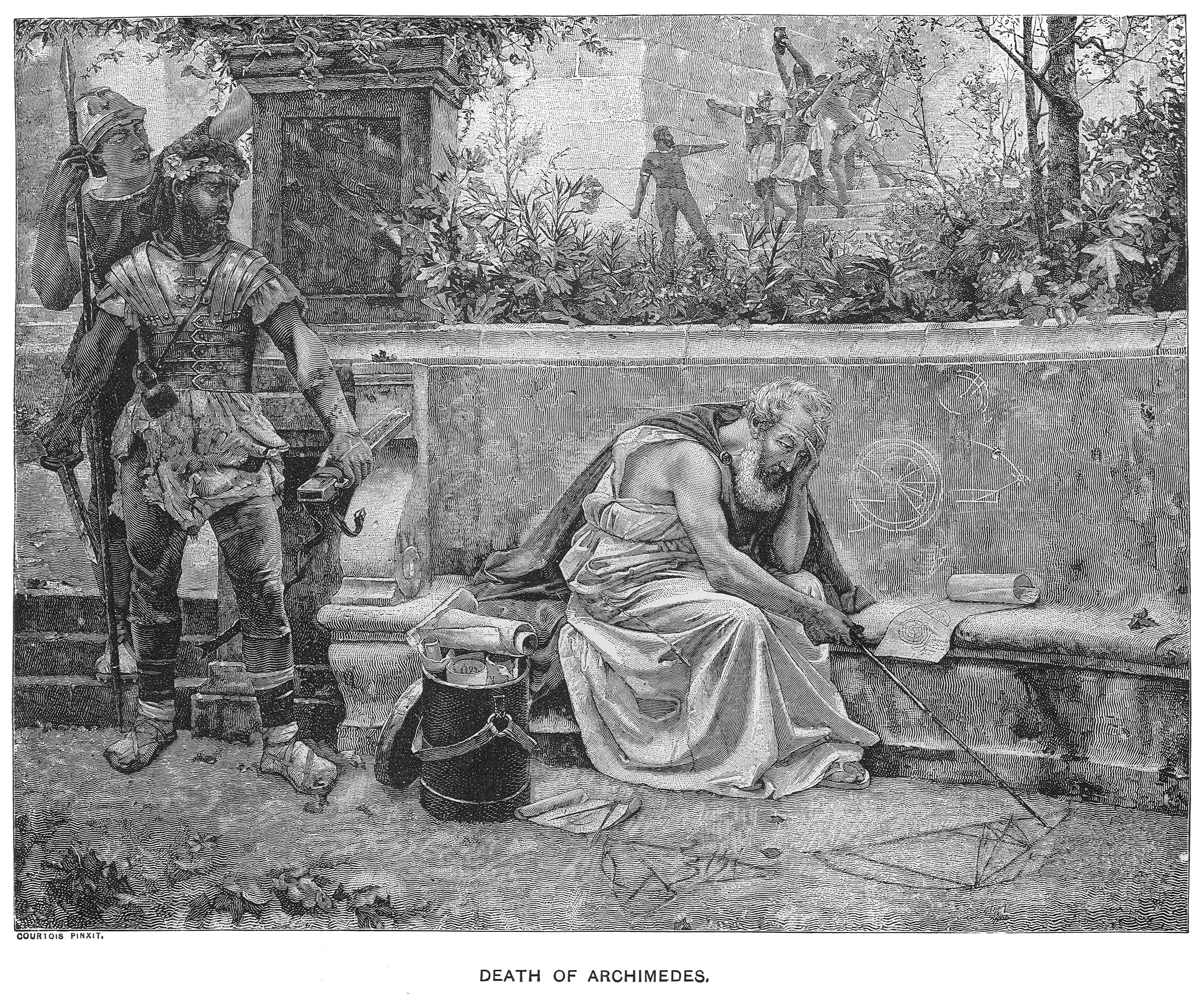
Classical geometry, the kind done in ancient Greece, was built up from straight lines and circles. These two elementary shapes corresponded to two tools that were used to draw them, the straightedge and the compass. The tools were physical correlates of logical propositions, used not only to procedurally construct a variety of forms in both two and three dimensions, but also to solve mathematical problems (in the ancient world, mathematics and geometry were basically synonymous). Euclid's Elements, a book which lays out these methods and gives Euclidean geometry its name, was the core mathematical textbook of Europe and the Middle East for two millenia.

One of the things that makes classical geometry so useful in architecture is its indifference to scale. It's concerned with ratio. Euclidean construction works just as well in a field, with stakes and ropes, as it does on paper with a ruler and compass, meaning an architectural plan constructed with with a ruler and compass can easily be reproduced at full scale. This geometric system is easy to read in the architecture of classical Greece and Rome. Small-scale ornament that could be completed by individual masons is often organic and expressive, but the overall forms are almost always governed by squares, rectangles and circles.
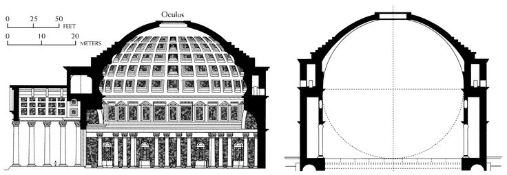
Even the ambitious and intricate forms of gothic cathedrals were ultimately described and constructed using straight lines and arcs, in a collection of techniques known as stereotomy.

II. The Modern Era
In 1637, René Descartes first published a description of his coordinate system for describing geometry numerically, which is not only still in use, but deeply embedded in the modern conception of space itself. It synthesized geometry with algebra and arithmetic, allowing numerical analysis of form and the visualization of mathematical functions. What it did not do was provide any efficient way of drawing algebraic curves. They had to be plotted one point at a time, and interpolated by hand. Combined with a renewed enthusiasm for classical civilization, this meant that that the revolutionary mathematics of the Enlightenment had basically no effect on the geometry used in the design and construction of buildings.
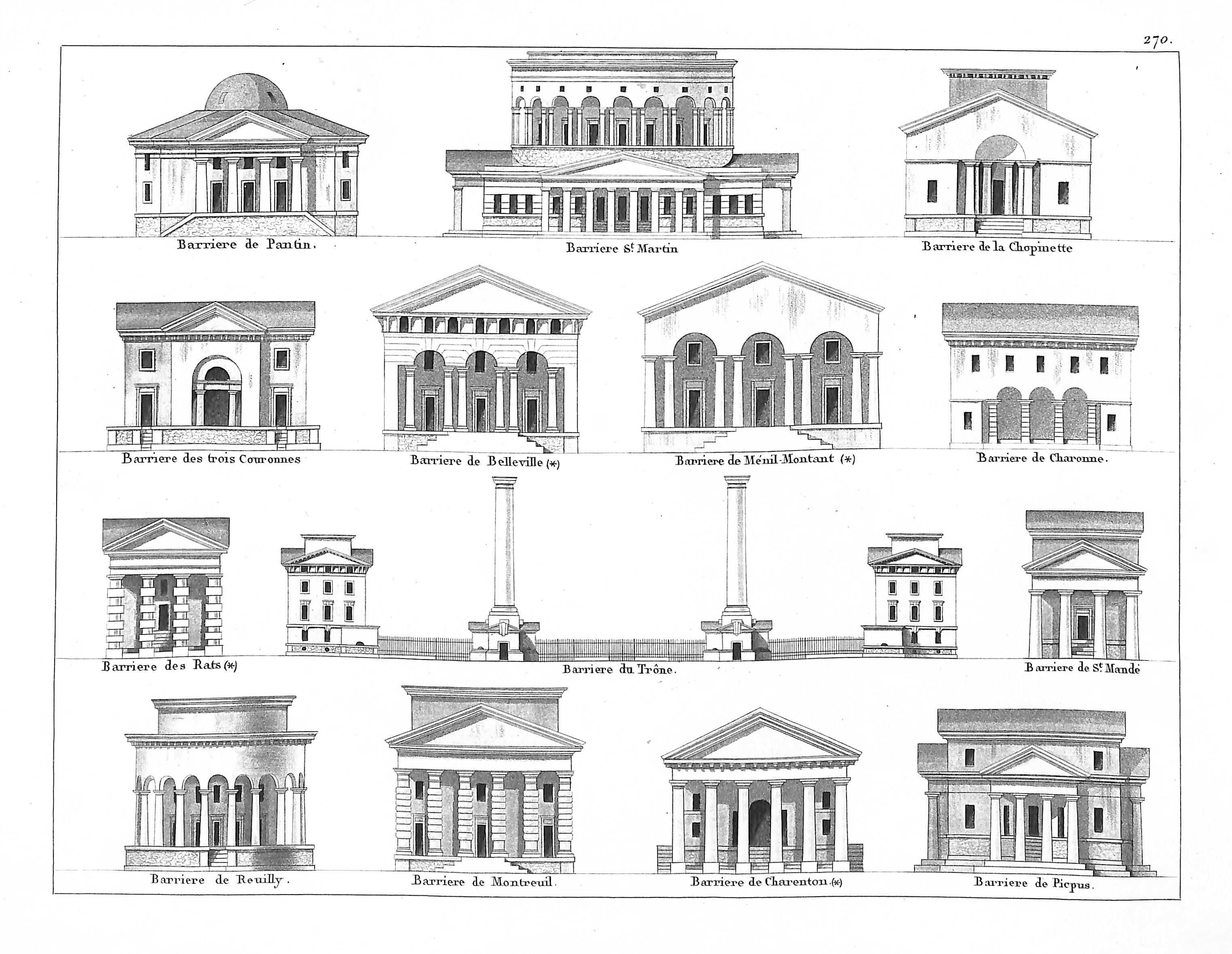
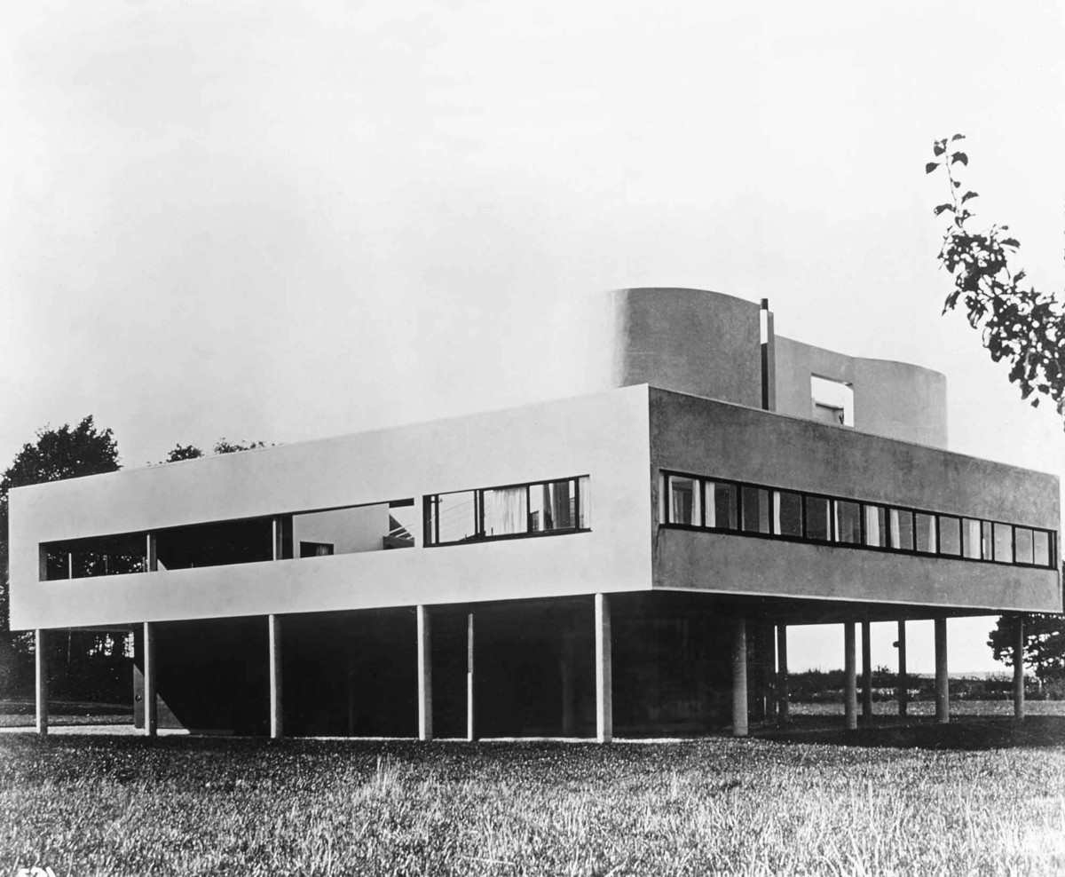
The Industrial Revolution altered this state of affairs only by pushing it to new extremes. After all, straight lines and circles aren't just the basic actions of mechanical drawing, but of mechanics in general. Translating linear to circular motion, and vice versa, is essentially the only thing machines do.
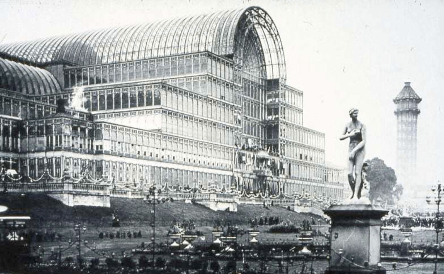
The artisan-crafted details and ornamentation that were once exempt from the demands of mathematical description seemed, to the most prominent architects of the modernist period, irrelevant, backwards, a waste of valuable labor. Euclidean purity was not only a practical imperative, but a moral one.
III. Splines
But there's one area of industrial design where arcs and straight lines will only get you so far, which toward the end of the 1930s suddenly became extremely important.
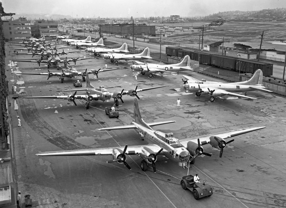
To design and produce aircraft at the speed and scale required for WWII, engineers borrowed a drafting device from boatbuilding, called a spline.

A spline is a flexible strip of wood, held in place with weights at specified control points. The wood, natuarally adjusting to minimize its curvature, creates a smooth interpolation of the points. And, like drawing with a compass and straightedge, this process scales up: a plank of wood applied to the ribs of a hull will minimize its curvature in the same way as a spline pinned to the locations of the ribs on a drawing, resulting in the same shape.
In the years after the war sinuous, aeronautic, non-circular curves seemed to evoke all that was new and exciting in the world: speed, modernity, the future, the space age.
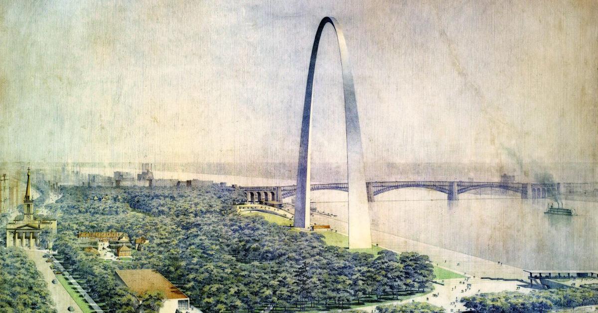

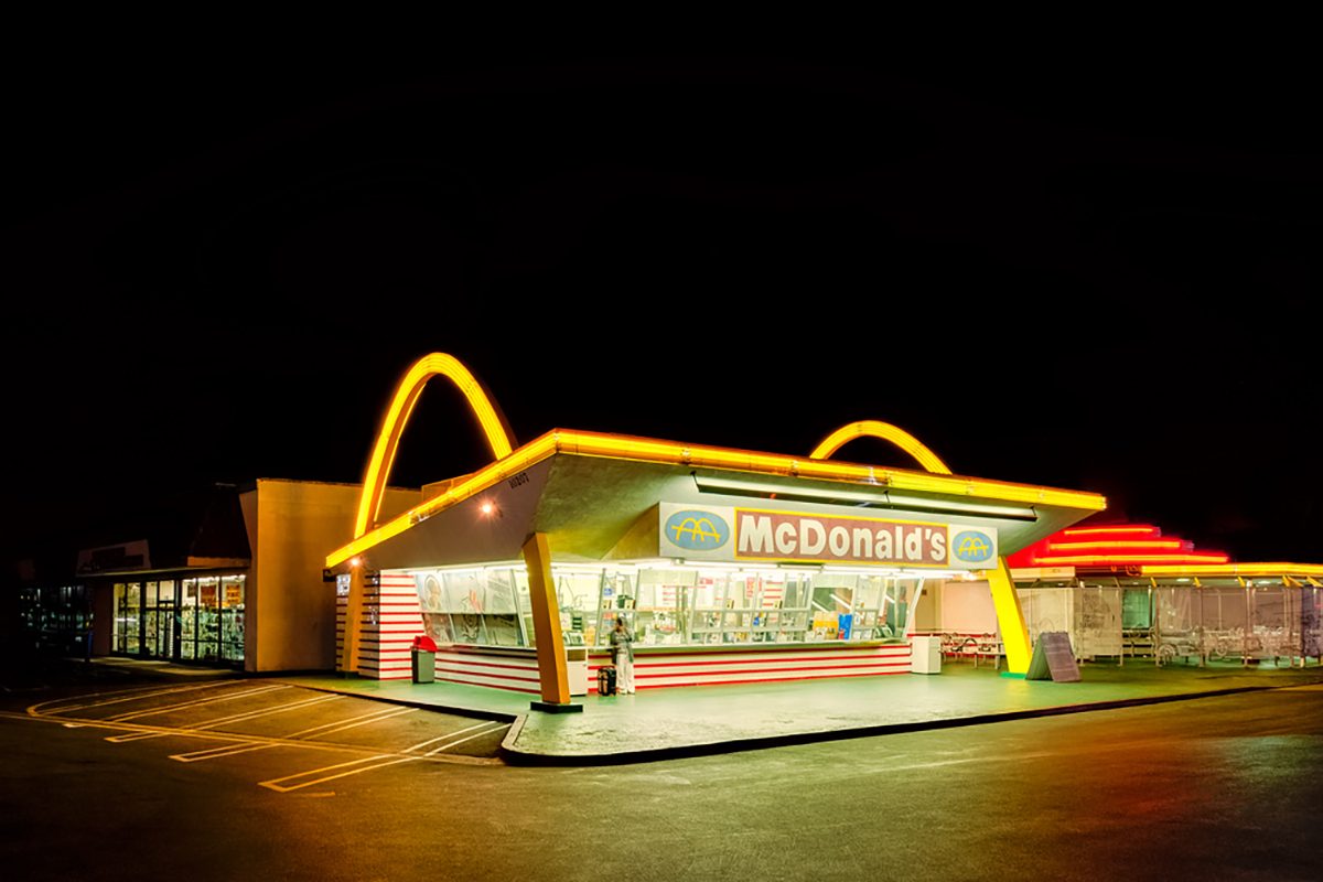
But when it came to industrial mass production, there was a problem. The exact opposite problem, in fact, to the one of drawing algebraic curves in the time of Descartes: smooth, freeform curves were easy enough to draw, using a spline, but there was no mathematical way to describe them. (Even the examples above use parabolas or catenaries, rather than true freeform curves.)
A method for describing freeform curves and surfaces for use in industrial and computational production was devised by two engineers working for car manufacturers in France, Pierre Bézier (Renault) and Paul de Casteljau (Citroën). Within a few years, cars went from looking like this:
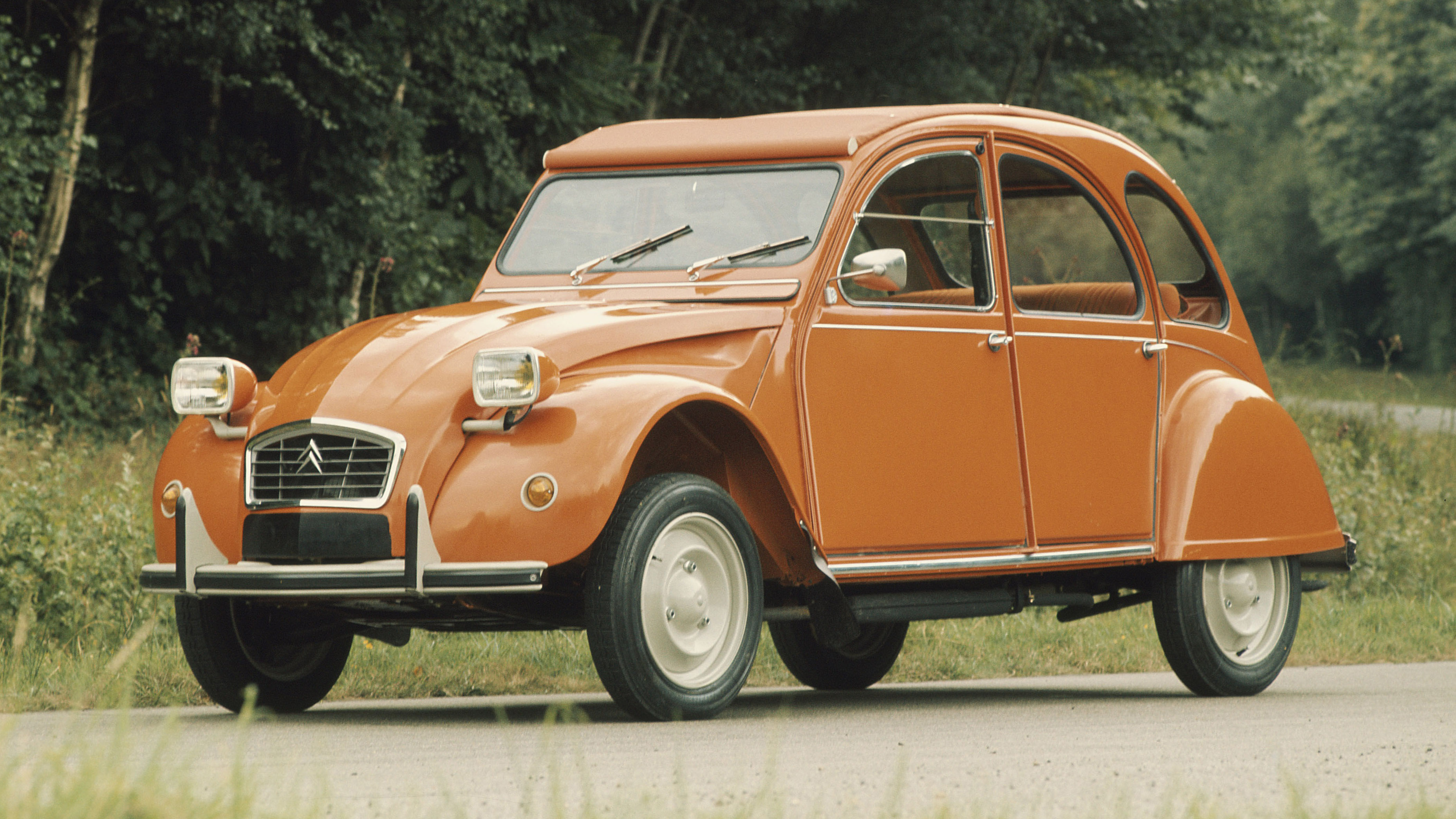
to this:

It took some time for sophisticated digital modeling to become widespread in architecture, but the formal novelty characteristic of many projects since the turn of the 21st century wouldn't be possible without it. Today NURBS are one of two main paradigms for computational geometry (the other, meshes, may eventually be covered in a separate sequence).

Let's take a look at how this system works.
NURBS
The concept at the core of NURBS geometry is the parametric curve. Say the start end end points of a curve are parameter 0 and 1, respectively. Since the curve is continuous, every point along it now has a value between 0 to 1 (so parameter 0.5 would be halfway along the curve, for instance).

We can then use an algebraic equation to describe the x and y (and z) values the curve should have at each parameter. For the simplest Bézier curves this is a quadratic equation, the kind that describes a parabola.

We define this curve by adding a third control point. Say we want to know the location of the curve at parameter 0.5: we find the point halfway between P0 and P1, and the point halfway between P1 and P2. Then we find the point halfway between those two points. If you were to write this out algebraically, using the coordinates of the points, you would get a quadratic equation (one whose highest exponent is a square). We can extend this same process by adding a fourth point, resulting a cubic equation, and so on up to higher degrees.


But these curves quickly become impractical to deal with and computationally demanding. An alternative is to join multiple lower-order Bézier curves end-to-end, aligning the control points when we want smooth transitions from one piece to the next:
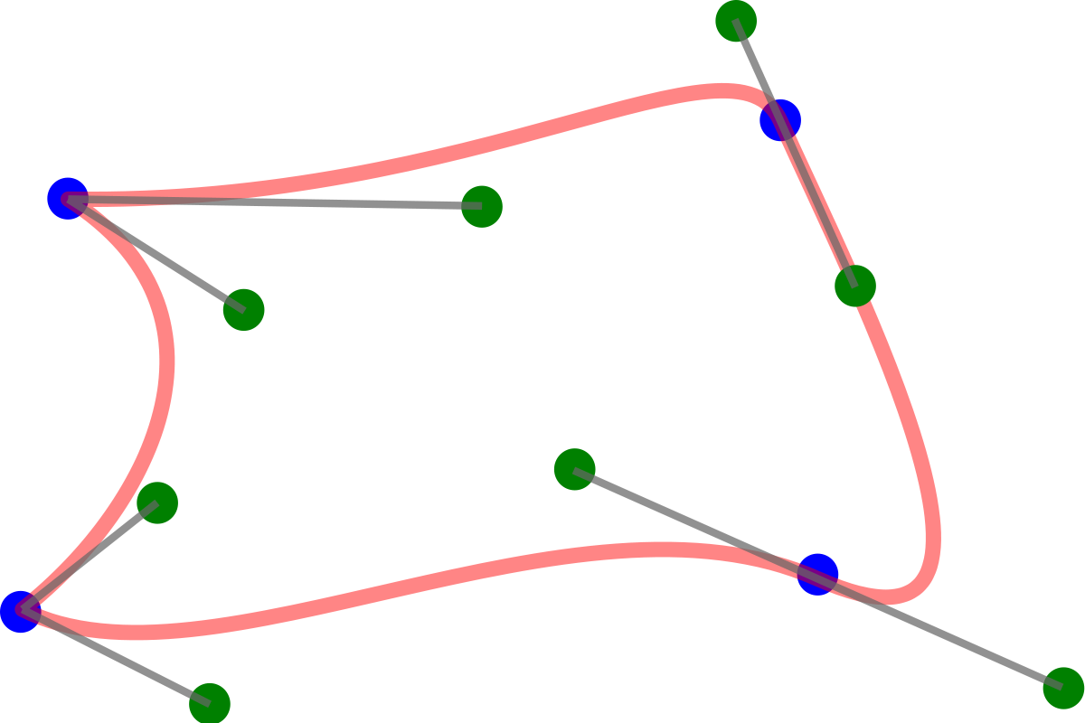
If you've used the pen tool to create smooth curves in Adobe Illustrator, then you've used these Bézier Splines. But Rhino uses a different alternative, called Basis Splines, or B-Splines. In a B-Spline, the influence of control points transitions smoothly from one section of the curve to the next. The higher the degree of a curve, the farther the influence of each control point extends.
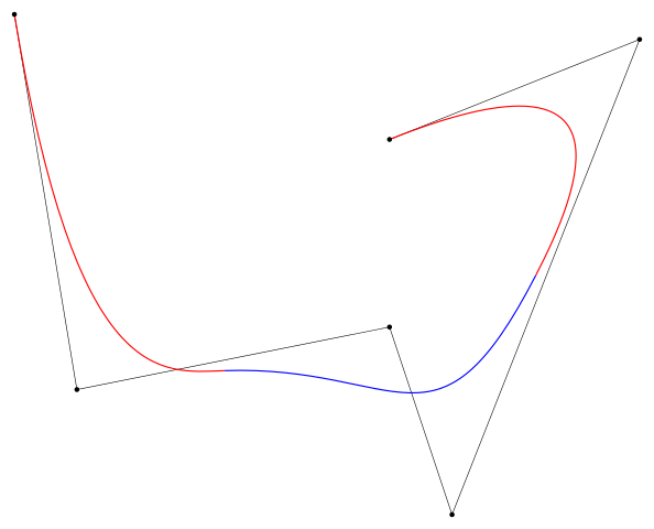
The boundaries between zones of influence are called knots. If these knots are spaced irregularly, then we call the B-Spline Non-Uniform.
Unfortunately, these quadratic and higher equations don't give us the ability to draw circles! (Or ellipses, for that matter.) This is a pretty serious shortcoming, which is solved by giving control points different weight. Points with higher weight "attract" the curve more. A spline that's weighted like this is called rational (referring to the ratio between different weights).
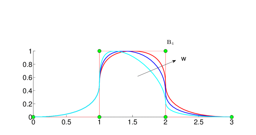
And there you have it: Non-Uniform Rational B-Splines. To create a surface, we use a quadrilateral grid of control points, defining splines in the x and y directions. But to avoid confusion with the global coordinate system we call these directions U and V.

This grid structure means that all NURBS surfaces are actually deformed rectangular sheets, although we can trim them so parts we don't need are "hidden." The concepts of degree and weight apply to surfaces just as they do to curves.

At this point, it's time to start working with NURBS in Rhino to get a feel for them.
Tutorial: Working with NURBS
To start experimenting with NURBS geometry, use the Curve command. Change "Degree" to 1 in the command prompt, then click a few times arbitrarily to create a curve, like so:

The resulting curve is made up of straight line segments with sharp corners. It isn't a polyline, sctrictly speaking, but behaves a lot like one. Now use Curve again, but set degree to 2, and click the corners of your last object in the same order.

This time you get a smooth curve. If you select it, you'll see that the control points which determine the shape are in the places you clicked, not on the curve itself. Press Escape to hide the control points, and draw two more curves this way, with degree 3 and degree 4.

Each curve has the same control points, but the result is smoother the higher the degree. Now Move one of the control points in the middle of the degree-2 curve. You'll see that the control point only influences a piece of the curve, outside of which nothing you do has any effect. Now try this with the degree-3 curve, and you'll see that the area of influence extends further along the curve.
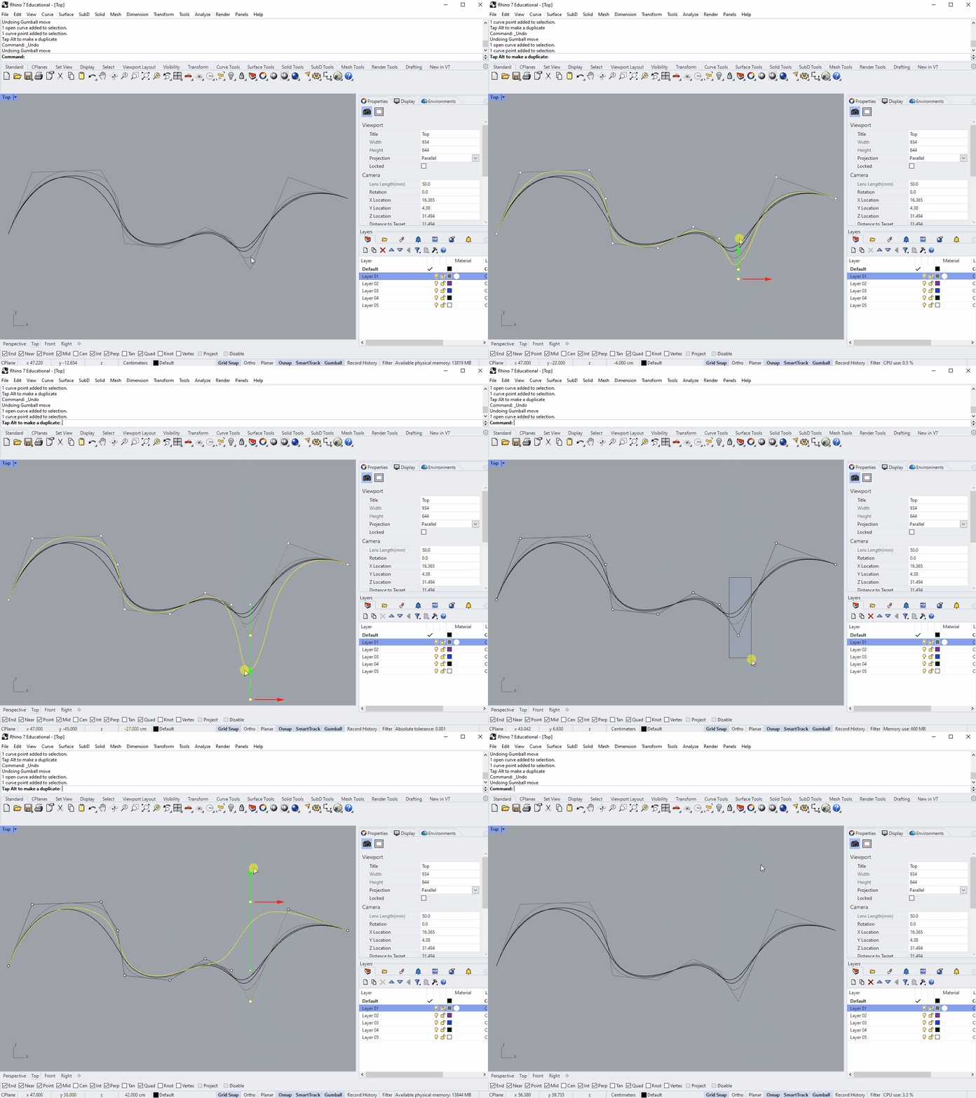
You can imagine the influence of control points being more "spread out" the higher the degree of the curve, which is why a curve with given control points get smoother as degree increases.
Currently the control points in these curves are all weighted equally. To give a point more or less influence, select it and use the Weight command. Play with the slider to see how higher or lower weight affects the curve.

When drawing a smooth line like this, often what's important is what points the curve passes through, rather than where the invisible control points happen to be. For these cases, InterpCrv (for "interpolate curve") lets you draw a curve through a series of points.

Working with NURBS Surfaces
Next we'll look at working with surfaces. As outlined earlier, a NURBS surface is made from a network of curves which cross each other in two (roughly) perpendicular directions. To avoid confusion with the X and Y axes of the space containing the geometry, these two directions are called U and V.
In perspective view, create a Plane. Turning PointsOn (F10) will allout you to select and move the control points, which in this case are only at the corners. Try moving two opposite corners upwards in the Z direction, and you'll end up with a saddle shape (technically, a "hyperbolic parabaloid").

This is a doubly-curved surface, meaning that to make it in the real world from a flat plane the material would have to stretch. You can check the curvature of a surface using CurvatureAnalysis and clicking "AutoRange." Areas where curves in the U and V directions bend in opposite directions, like most of this saddle surface, have "negative" curvature, while if they curve in the same direction (like on a sphere), they have "positive" curvature. Surfaces that don't need to stretch have zero curvature, even if they aren't flat. So a cylinders and cones have zero curvature, because you can make them by rolling a non-stretchy piece of paper.
But! This is actually only a degree-1 surface. The NURBS curves which define it in the U and V directions are just the straight lines at the edges. Check this by clicking the "Details" button in the Properties panel.

Since the U and V curves are degree-1 (straight lines) all the intermediate sections have to be degree-1 too. Countour the surface in either the X or Y direction, and you'll find that the results are all, indeed, just straight lines.

For a Plane with more flexibility, select Deformable in the command prompt when creating it. This lets you choose the number and degree of the curves in the U and V directions. Accept the default settings to create a surface with 10 degree-3 curves in both the U and V directions.
You can see the surface's additional isocurves, and if you turn PointsOn again, you'll see a control point at each intersection. Try moving these around to create a smooth, complex surface.

Weight can be adjusted on these control points just like when we were working with curves. You can also adjust larger areas smoothly using SoftEditSrf:

If you find that you need to make finer adjustments to an existing surface, or simplify one that is too complex, you can Rebuild it with your desired number of U and V isocurves, also specifying the degree.

Trimmed Surfaces
Since every NURBS surface is made up of a grid of curves, mathematically speaking they're all deformations of a rectangular sheet. For geometry with a different outline, we can trim the surface, but the rest of the sheet is still "there," just hidden. For an illustration of this, draw a Circle. (While you have it in front of you, check the weight of the corners vs the points on the circle. The corners have a weight of sin(φ/2).) Use PlanarSrf on it, and you'll create what looks like a disc. But use Untrim on its edge, and the rest of the rectangular sheet will be revealed.

Creating Surfaces from Curves
Most of the time, we don't want to build complex geometry starting from flat rectangles. A common alternative is to start with the contours in either the U or V direction, and fit a surface through them using Loft (like the spline, the term comes from boatbuilding, where it describes fitting the planks of the hull around the ribs). Lets take a break from the Casa Bahia Azul to create a model of this chair, designed by Vemer Panton for Vitra in the 1960s:

Start by placing the drawings below in Rhino using Picture, and scaling them just as we did in the Rhino 2D tutorial.
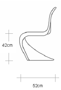
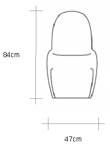
Make these reference drawings slightly transparent (using the materials tab in the properties panel), and orient them in 3D space to align them with the views they depict. This will make it easier to create accurate 3D curves by switching between Front and Right views. Placing them on the X and Y axes will also make tracing them easier.

Now, starting in Right view, trace the three main contours of the chair: the outer edge, the peak of the lip, and the center (this last one is partly hidden, but you can easily appoximate the missing segments). Do this using InterpCrv, trying to minimize the number of times you click.

After you've drawn each curve, you can fine-tune them by adjusting the control points directly.

Switch to Perspective view and drag your lines out in the X direction, just enough so that they're in the correct order. (Since the chair is symmetrical, we're only going to worry about one side.) Then switch to Front view. Now you can once again adjust your curves using their control points so that they match the underlay drawing. As long as you only drag them left and right, their appearance from the side should be largely unaffected. But you may need to switch between views a few times, adjusting as you go, before you're satisfied with the results.

Once your curves seem about right, it's time to create a surface from them. Back in Perspective view, Mirror the two outside curves across the center, and use the Loft command. Select the curves in order and hit Enter or Spacebar to bring up the Loft Options dialog box.

Click through the various options here to get a sense of the possible outcomes. For instance, if we choose "Tight" as our Loft Style and "Do Not Simplify" under "Cross-section curve options," we'll get a surface that passes through our curves exactly and has a lot of control points (as seen by the number of isocurves in the preview).

But for this model, our priority is creating a smooth surface that's easy to adjust. Change the style to "Loose" and the surface won't intersect your curves exactly, but will be simpler overall. Then click the "Rebuild with (10) control points" radio button. Without this checked, Rhino will consider the placement of your control points when creating the lofted surface, which can cause problems if some curves have more than others, or have areas where they're more densely spaced. Rebuilding the curves gives them all matching numbers of evenly spaced control points.
If the result still seems way off, go back and adjust your input curves. But if it's reasonably close, accept the results to create the surface. To make further adjustments, you can use PointsOn (F10) to turn on the surface's control points, and adjust them manually (the main annoyance here is keeping the chair symmetrical).


Once everything seems right, you can use OffsetSrf to give your chair thickness, and even play with the material to make it glossy and reflective (materials will be covered in more depth in the next sequence).

Modeling Terrain
Now that you're starting to get comfortable with NURBS, let's try a more a challenging exercise: modeling the terrain surrounding the Casa Bahia Azul. Rather than walk you through it step by step, I'll just give you some general hints as to how to go about it. This illustrates one possible workflow for creating the terrain, but feel free to experiment with others.
The isolines which describe the terrain are on the site plan we originally used to find the scale of the building.
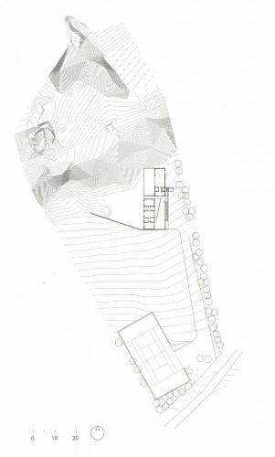
If you aren't familiar with topographical drawings, these lines mark regularly spaced contours of the landscape, meaning every point on a given line is at the same elevation. Based on where they intersect with the building, there seems to be a contour line every 25 centimeters.
Trace the contours. There are a lot of them, so you don't need to be too precious about it. As the cliff gets steeper the resolution of the image isn't high enough to distinguish them, so fake it as best you can. TweenCurves can help you create denser areas by adding multiple curves at once, but make sure the resulting lines never cross each other (which would imply a single point at two different elevations).
Where the topography lines are interrupted by the building, continue them across it as if it isn't there. You'll trim out this part of the surface at the end.

You can see in the image above that I've ignored not only the house but also the flat area between the house and retaining wall. The hard break in the landscape on either side of the wall, combined with the continuous slope just west of the wall, makes this a tricky shape to model with NURBS. (Natural forms like this are often better approached with mesh modeling, but that's outside the scope of this tutorial sequence.) My approach will be to create the whole hillside in something like its original state, and then replace the re-graded portions afterwards.
Space out the topography lines in the Z direction using Distribute, then Loft them. Move the resulting surface to the currect height, and Trim out the areas for the house and landscaping. You may find it helpful to ExtractIsocurves from the surface to create your cutting geometry.

Then draw the regraded topography lines for the slope up to the retaining wall, and move them to the correct height. I've also added an extra curve to smooth out the transition to the flat area. To create this surface I'm opting to use NetwrkSrf, which works a bit like Loft but takes input curves in both the U and V directions.

Then I create outline curves for the remaining areas, including a couple that overlap with the slope to smooth out the transitions between surfaces. I fit a surface through these using Patch a flexible (but crude) way of fitting a surface through curves and other geometry.

Trim away the excess and clean up any messy areas manually to complete the terrain.

Conclusion
Working with NURBS gives you the flexibility to create a huge range of forms, but it can take time to get a feel for them, and knowing some of the underlying math makes their behavior easier to understand. Now that you've been introduced Rhino and have a model of a building to work with, the next sequence will cover using that model to produce architectural drawings and images.
Post-Sequence Challenge
For more practice before moving on to the next sequence, try modeling another building on your own, following the same steps we used in this sequence. Some suggestions of projects that are more challenging than the Casa Bahia Azul, but still manageable, are below.
- Barcelona Pavilion, Ludwig Mies van der Rohe
- Casa de Vidro, Lina Bo Bardi
- Bait Ur Rouf Mosque, Marina Tabassum
- Gando Primary School, Francis Kéré
- Nakagin Capsule Tower, Kisho Kurokawa
- San Pedro Chapel, Paulo Mendes da Rocha
- Glass Pavilion, Toledo Museum of Art, SANAA

